BAT Sparks Up

I first started running comedy clubs in 1998. Of course, you could still smoke in pubs and bars in those days. I used to joke to the punters that it was a healthy option to come to comedy because on the one hand they would lose 5 minutes off their lives (perhaps) with each cigarette, but on the other hand if they laughed they would get it back.
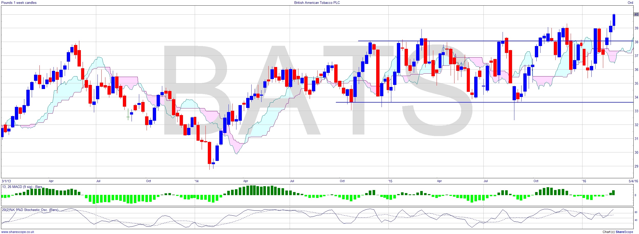
I wrote about tobacco, and more specifically BAT (BATS) twice last year. In June (British American Tobacco – The Future Is Lit Up) I looked at the future of tobacco markets and outside of the first world found 26 countries where there is an expectation of increased revenue from cigarette sales. BAT would find future growth in those markets at least, I wrote, and has consistently out-performed the FTSE. OK, what hasn’t, but that’s how you calculate Alpha so it is a relevant figure. I wrote again in October (No News Is Good News), commenting that it was range-bound. Well it ain’t range-bound any more.
It’s taken a while, but it seems to have broken free of the resistance just below £40. It has been blurred around the edges of this range before, but here’s a clear confirmed move up on the weekly chart. A fairly decent MACD that at least isn’t arguing with a move up. One of the problems with ranges is that many indicators are bullish simply because they’ve been flat, so saying it’s above the cloud is pointless as the cloud will have narrowed during any range-bound time.
I posted the P+F chart back in June. It’s really clear when stocks break up through resistance on P+F charts, as you can see. I’ve marked the resistance level on. One thing you have to remember with P+F charts is that each ‘x’ and ‘o’ represents a price range, so they are not precise in terms of price action smaller than the ‘box size’, in this case 50p. That’s the whole idea: it cuts out the ‘noise’ of minor, and therefore insignificant, price action by ignoring small moves. It also condenses times of little or no price action, in effect ignoring time. Of course, this does mean that, just as regular charts under-represent much lower price moves that are enhanced on a log chart, so does the P+F. However, this chart covers the whole period from 1998 right through more than 17 years to 2016! It’s a hugely efficient use of screen space, and a very good way to quickly see what’s going on at a significant level.
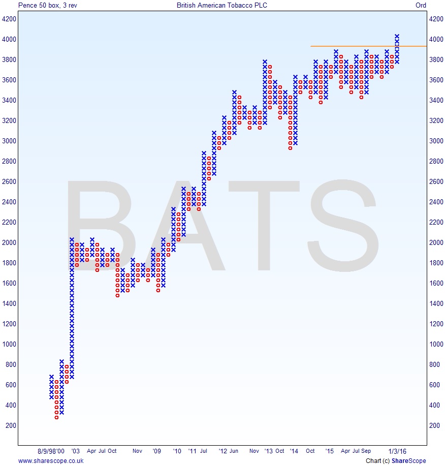
This congestion area that the price has now left could possibly lead to a measured move upwards. The difficulty here is determining how far the price travelled into the range, in order to set a target by estimating how far it’s likely to travel out. But even if we take, conservatively, the recent low as around £29, being generous and saying the range was at the bottom end £34, this would still give a £5 upside. Well, that’s over 10% so not too shabby.
A domestic view of shares in the FTSE 100 is hard these days because most of the shares in it are multi-nationals, and in some cases they’re even hard to classify in terms of sector as they have diversified over the years. You can try to make diversified a sector, but it isn’t!
There’s just one thing I want to know though. What happened to all the smoking rooms that there used to be? Are they ‘safe spaces’ for graduate trainees now, or maybe chill-out rooms?
Comments (0)