Greggs: Which Side Is Their Bread Buttered?

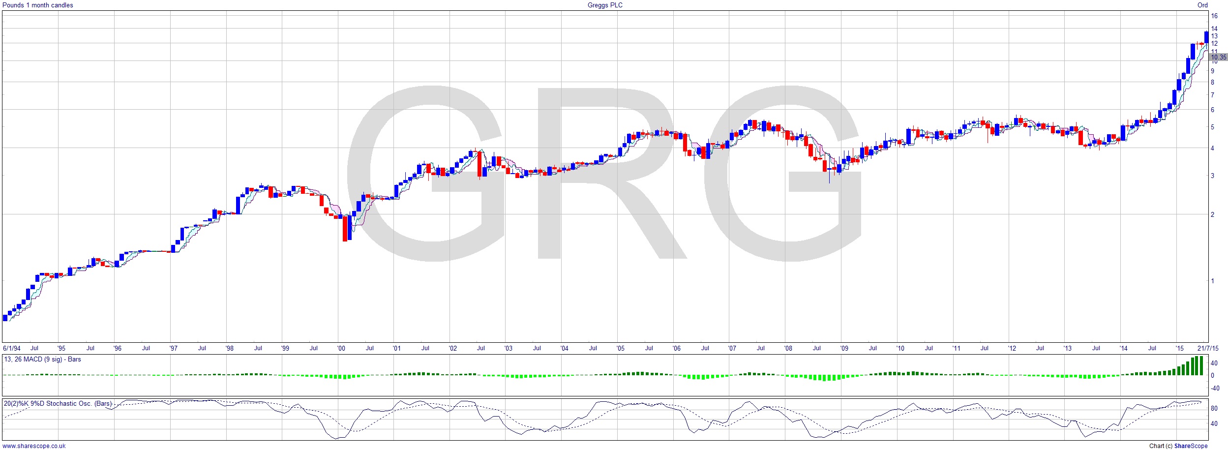
Greggs (GRG) has been a bit like Bitcoin. I remember hearing a commentator say that they’d thought Bitcoin at $1 was overpriced, then at $2, and so on… until it had reached around $1,000. Greggs has been similar. It just seemed to keep going up and up and up. The rallies in its history are just exemplary.
It’s investing £100m in its future and rationalising its operations, whilst increasing its stores from 1,700 to a proposed 2,000. When I lived in Twickenham I used to wake up to one of the best smells (I think most people would agree): the smell of freshly baked bread. I was a few metres away from the Greggs bakery, although Greggs didn’t have a presence in West London then, but there was a bakery, and I recall it was Allied Bakeries back then. Greggs are closing this and two other bakeries and upgrading other bakeries elsewhere. It’s changing its business model somewhat to focus less on traditional bakery produce and more on catering to the lunch and snack trade.
How is this all being reflected in the share price? Well the first chart is their fantastic success up until the early part of 2015. I’ve used a log scale (if you aren’t familiar with logarithmic charts, this shows the relative price changes). This is highly pertinent if you are an investor, as it’s easier to see where you made money. There is a constant problem with historical charts that aren’t using a log scale: they show little useful data about what are often the early years, where much money was to be made, as it will usually appear as more or less a flat line.
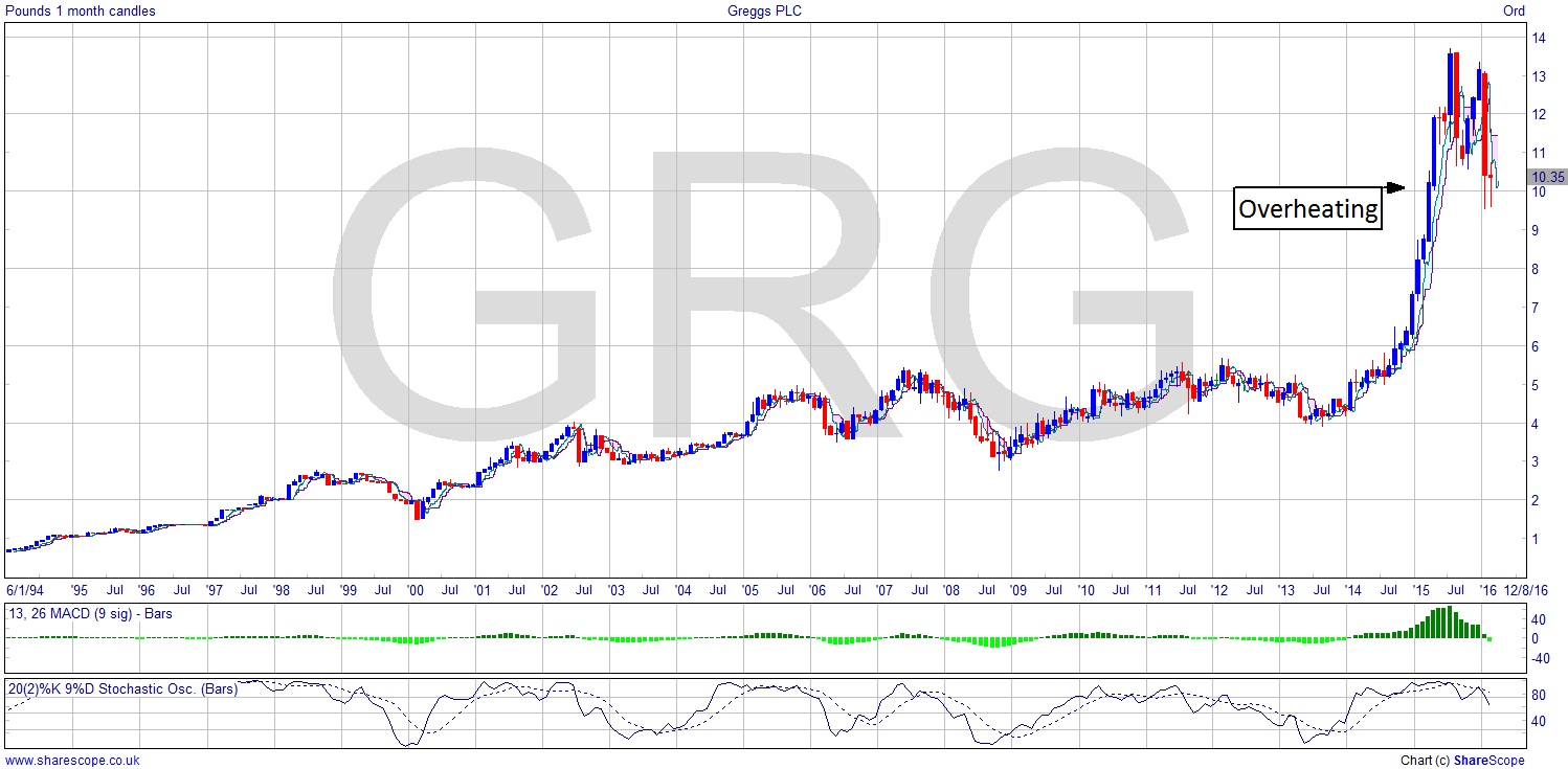
Up until 2015, this would have been a good one to have in your pension portfolio. Greggs didn’t even suffer much from the credit crisis. But the period from 2014 to mid-2015 was stellar. A three-fold gain. Going back to the regular chart and showing the price right up to date, we can clearly see it was overheating. There are some very strong moves upwards that are showing a hugely increased momentum, which is usually a sign of too much money chasing a share. It can’t last, and it doesn’t. Basically if it looks like the Tech Boom it is the Tech Boom. Maybe more of a bloomer here.
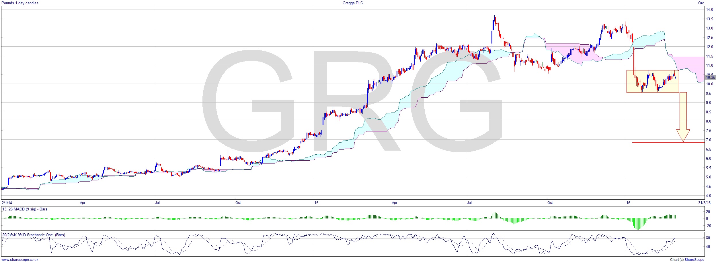
Either way it’s really started to pay those gains back. As always, for someone to make money someone else ultimately has to lose it, and this sort of chart pattern is typical of professional traders using the liquidity of the retail investors coming into the market to cash out above expectation. Thank you very much.
Now the stock is around 25% down from the ATH it’s a very unattractive proposition altogether. Who’d want to be long in Greggs right now? I certainly wouldn’t. And being short could be the answer. There’s a possible measured move on here and early entry could even be possible. A target of around £7 would be a nice move. It’s failing near the cloud bottom here on the daily chart, which is a sign of weakness. A bounce down from the cloud bottom would be a great short signal, and if that was in the congestion area (marked), then it could afford a higher entry than the breakout (not my favoured way to trade such a move at all). So, an entry more like over £10 with the breakout at £9.50. That’s a nice buffer in case it fakes out.
You can read about why I dislike breakouts in my Breakouts Are For Dummies article from last August by clicking on the link.
Comments (0)