You Can Read the Right Side of a Chart

There’s a popular myth that you can’t read the right hand side of a chart. Of course there is no precognition, we know that from science, but it’s hardly a blank page!
The first thing you know is that a trend is more likely to continue than change from one day to the next. That’s quite valuable information, although one day it’s possibly going to be an expensive philosophy, so what other things do we know about the right side of the chart?
First off, we have the good old staples Support and Resistance. This is possibly the most important concept in trading; they represent levels where trading psychology will help you. People are emotional around S+R for a number of possible reasons. They may have bought at a particular price so may cut their losses there if the stock looks increasingly unstable. It may be a price they missed out on in the past in which case they may buy there. It may be a level to take profits.
Breakouts are the classic. Joe Public gets in because S+R get broken. If you’ve not read many of my posts before then check out my 8th August post called ‘Breakouts are for Dummies’. But here we can say that a particular level, normally Resistance in the case of breakouts, will encourage activity.
We can never say ‘when’ a particular thing happens, we must always say ‘if’ a particular thing happens, but that doesn’t stop us knowing that some things are quite likely to happen and others not at all likely. So we have that on the right side too.
My ‘go to’ leading indicator is the Ichimoku chart. Using slightly more obscure but effective indicators gives you an edge. Most UK private investors don’t know about Ichimoku because none of the loser private investor training salesmen know about them so they haven’t been pushing them out there. Thankfully there is precious little literature available, so long may that continue.
Ickimokus are based on historical prices of course, but also identify times when important Support & Resistance levels are in play. They also identify grey areas within the clouds that are flashpoints if you like. There are certain things we know about them: above the cloud a price is generally bullish, and below bearish. Inside the cloud the price tends to go across and a jump across the cloud is a very strong signal. Why is this useful? Because the cloud uses a delay, usually based on 26 periods, which means it projects 26 periods into the future. Incidentally I only show the cloud lines, although there are two others which I found rather pointless.
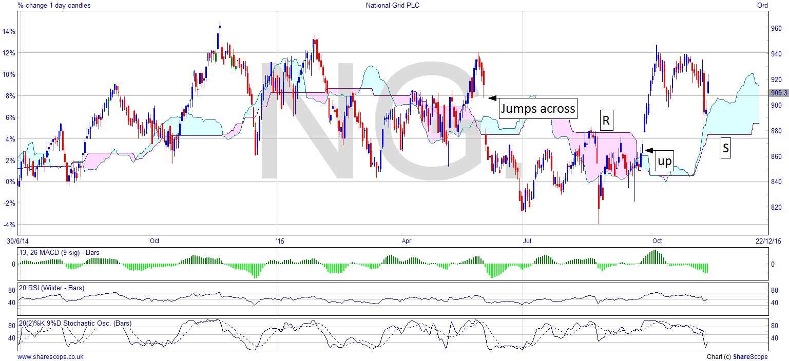
I’ve used the current National Grid (NG.) chart to illustrate this happening. We see a jump across the cloud and once it has the price falls off quickly. Nice little shorting opportunity there. The Resistance level at the top of the pink cloud which is the same level as the price gapped down to, obviously an emotive price, remains Resistance until the cloud moves down. We now know this is a less important level for a while, and the price, by simply going sideways, moves about the cloud beneath it – i.e. becomes bullish. The public are still looking at the breakout at that Resistance level and traders have the chance for early entry here, which takes advantage of the gap up too, and that’s where they’ll all be rushing in like fools, paying 30p more than canny traders did while getting poor fills and bigger spreads. Where the chart is now it may re-enter that cloud by simply going sideways again. If it does then that Resistance level is now Support. So we have a reasonable expectation that National Grid won’t fall below that price, or that if it does it’s particularly bearish.
Next time someone tells you that the right side of the chart can’t be read adopt a stance I heard recently: never interrupt a competitor when they’re making a mistake. Either that or tell them about my column because I need more readers, thanks.
Comments (0)