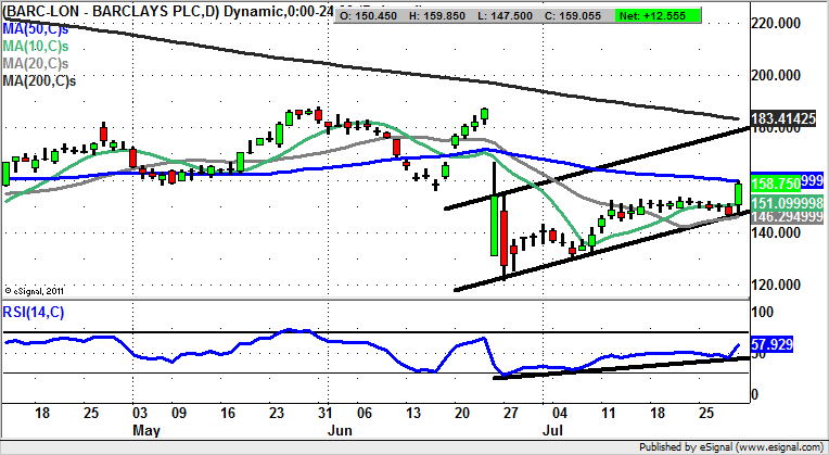
Chart of the Day: Barclays

It may be unfair to suggest that the banking sector is effectively a long-term sell, but this does at least explain much of the recent past in terms of the fundamentals, and of course the big bailouts. With this in mind we look at Barclays.
Barclays (LON:BARC): Above 20 Day Line Points to 180p
In the case of Barclays it would appear that even though this bank is regarded by some as being the “best of a bad bunch” on the High Street, this does not mean that it has been or will be plain sailing. The point is underlined in the wake of the latest update from the company, which reveals a further £400 million PPI hit, accompanying a 21% fall in H1 2016 profits. Perhaps the explanation for the initial positive share price reaction here is that so much negativity has already been factored in. This can be witnessed on the daily chart where we have seen a solid bounce for the shares in the wake of yesterday’s rebound off the floor of a June rising trend channel / 20 day moving average at 146p. The technical view now is that an end of week close above the 50 day moving average at 159.75p could lead to the top of last month’s channel at 180p over the following 4-6 weeks. In the meantime any dips towards the low 150s can be regarded as buying opportunities, if only to improve the risk/reward ratio of going long at a relatively large distance from 2016 lows.

Comments (0)