Where next for stock markets?

Given what we have seen in stock markets in recent weeks, it was easy to pick the topic for this month’s charting article. Volatility has jumped, world markets fell heavily – is it the beginning of the end of the long trend upwards for shares?
A recent history lesson
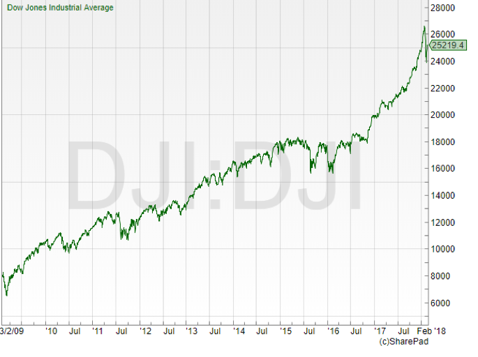
Let’s go back to where this all started. I will focus on the US index, the Dow Jones Industrial Average, as it really will be the American stock market that ends up dictating where the rest of the world is going to go. The trend that is now in place started from the financial crisis lows in March 2009. Back then, the low for the Dow was just below 6,500 – by the end of January this year it had traded above 26,500.
This market has come a long way in a little under nine years. There is a classic market cliché: “bull markets climb a wall of fear”. This refers to the concern amongst investors that, as the market goes higher, surely a crash or correction can’t be too far away. But recent years have seen a relatively painless climb. The last bout of major volatility, where it appeared markets were not too sure which way to go, was at the time of the US Presidential Election. It was received wisdom that a Trump win would see a chunk wiped off the stock market. But all the volatility happened in the “out of hours” market ahead of the official open. Since then, markets have continued their wave higher, defying the doomsayers’ call for a top.
What went wrong in February?
If there is one universal truth about major moves in markets it is this: like the Spanish Inquisition, no one really expects it. Or maybe more accurately, no one really manages to forecast it. There is always a scrabble afterwards to try and explain why the market has plunged or risen. This may help fill newspapers but doesn’t really help us much after the fact.
Coming into February, markets looked healthy. January 26 saw the Dow Jones hit fresh all-time highs at 26,616. But by February 9th the index had traded as low as 23,360.
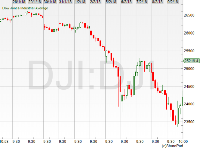
So, what was the reason for the sharp falls? Investors’ fears about creeping inflation and the possibility of interest rates rising quicker than expected were a couple of the more popular explanations. The move was arguably exacerbated by a couple of products designed to take advantage of ongoing low volatility in the markets. Plus of course, we have that timeless market classic – fear! We had not seen it for a while but there was definitely the feeling of selling feeding even more selling, like an avalanche picking up speed as it slides downwards. Was this the crash everyone was worried about? Better head for the exits just in case…
How is the trend looking now?
The really short answer to that is – untroubled.
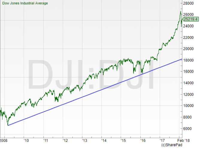
Of course, it does all depend on which trend you are looking at. If we take the 2009 financial crisis lows as our starting point, clearly this is nothing more than the market having the smallest of stumbles – a move which was long overdue by most people’s measures. That longer-term trend line comes in around the 18,000 mark. This means that, even if the Dow Jones index was to drop another 20% from current levels, it still would be some distance above the trend line. Let’s take a look at some more recent history – the run that markets have enjoyed since the US Presidential Election.
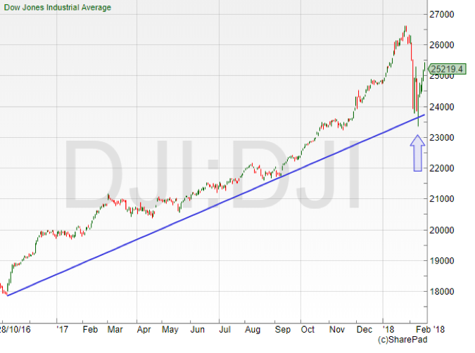
This is a little more interesting. The volatility that markets endured during February saw that one year-plus trend line pierced – but no follow through in terms of extra pressure and selling, leading to steeper falls.
Looking at this chart in isolation, this really is just a pullback towards the trend – it’s nothing to worry about. It is the famous “healthy correction” that was definitely long overdue. Now, it was pretty extreme in terms of how quickly it happened. But, given the amount of complacency we had seen in stock markets for months and maybe even years, any sell off always had a high chance of spooking investors who had got used to markets just gently grinding their way out to fresh all-time highs on a very regular basis.
Assuming this is just a correction – what next? The expectation would be for a run back to the previous all-time highs set towards the end of January and, as that trend is still definitely up, a breakout through here and on to fresh highs once more.
What are the danger signs this isn’t just a correction?
There’s always the chance of course that this bounce away from the longer-term trend line ends up being of the “dead cat” variety – i.e. the market rallies but does not go back to the all-time highs and turns down once again. What do we need to watch for a hint that maybe sentiment is actually starting to shift?
I think there’s a straightforward answer to this one. And it is how the market reacts if it does revisit that low from the middle of February, which as mentioned is 23,360 on the Dow Jones. If the falls experienced are just a correction, then once again we should see the buyers stepping in. The psychology behind this is simple enough to understand. Plenty of investors will have watched the markets plunging and then bouncing back – and will be kicking themselves for not buying in. A move back to the old lows would be seen as a second bite of the cherry. So, if the market holds above that 23,360 low then all is well.
However, if the market breaks through then that is when things get a little bit more interesting. So far this is acting as an important bottom, and there has been a collective sigh of relief amongst investors that markets were not going to fall further. If that low is taken out, things are different. A level in the past that brought the buyers back in previously because they thought stocks were something of a bargain has not done the same thing this time around. A break below that old low could well see another injection of fear into stock markets and pile the pressure on for another move down.
Don’t miss David’s next piece in the next edition of Master Investor Magazine – Sign-up HERE for FREE
Regardless of what many talking heads may say, it is very difficult to predict when and how a market will move. As technical analysts, all we can do is use the reference points we have and have a plan in place if those levels get broken or hold. But that gives us a plan that is far more advanced than many who are trading or investing! Markets have definitely got a little more interesting over the past month and the focus now will be just how confident are investors that there is more juice left in the tank if markets turn south once more.
Personally, I think this has been a much overdue reminder of just how volatile markets can be. It has made it more interesting from a short to medium term trading point of view. And I do feel that investors will have been quite spooked by some of the steep falls during February, so it may be some time before we see fresh all-time highs for stock markets.
Chart of the Month
Of course, one person’s panicking market is another’s buying opportunity. So, I thought a good choice for this month would be – a little like the Dow chart – a share that did fall but is showing the potential to bounce back, leaving major trends intact.
Bellway (LON:BWY) is a FTSE 250 company, but is actually just outside the FTSE 100 as, at the time of writing it, was the 110th largest company by market capitalisation on the UK market. It’s one of the UK’s largest housebuilders. This has been a great sector in recent years and Bellway is no exception – since 2012 the share price is up more than fourfold.
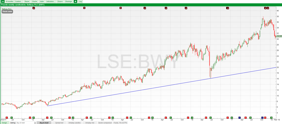
This run higher has not been without its dramas. The housebuilders took some of the biggest hits immediately following the UK’s referendum on leaving the EU – but the price recovered and has moved on to fresh highs since.
I think what’s interesting here is the slide over the past month or so. It has been quite steep, and the share price has lost nearly 20% – but that doesn’t change the bigger picture just yet. Here’s a close-up view on the chart.
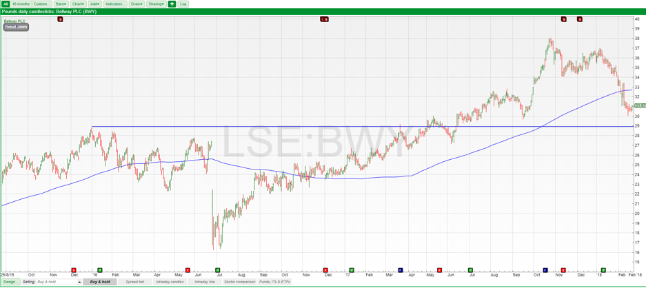
There are some really big levels to watch here. The old highs from 2016 shown by the horizontal line have not been breached. That comes in around the 2,900p level. An area that has been resistance in the past (stopping the price from going up) can turn into support if it is retested.
The other line on the chart is the 200-day moving average. The price has fallen below but this is just early days. Assuming the longer-term uptrend stays intact, it does suggest the share price could be relatively cheap here, compared to where it has been over the past 12 months.
Comments (0)