How to know when to sell

The novice investor or trader often obsesses about where to get into a trade or investment and may spend much time trying to refine this process. Indeed there is a whole industry around the perfect entry signal; buy now or miss out on massive gains, XYZ share cannot go any lower…
Of course, we all want to get in at the “right” price (whatever that actually means), but what delivers us the final profit or loss is where we get out – where we sell the investment and realise the gains in cold, hard cash. Now, this is hardly rocket science of course, but still in my experience much less time is spent on examining signs that it is time to head for the exits. So I thought it would be a good topic for this month’s issue – what are the signs from the charts that the best of the move we are in may well have happened and it is time to at least start about thinking taking some money off the table and banking those paper profits? As with many other things to do with charting and technical analysis, I am always keen on keeping this simple, so here are some possible approaches.
Break of a trend line
I have previously covered the good chartists’ mantra “the trend is your friend”. Too many of us have a problem buying into a rising market – and conversely flock to markets that are falling like a stone and assuming we are blessed with gift of second sight and able to pick the absolute turning point. But if we are fortunate and sensible enough to buy into a good uptrend and ride that move higher, we should be tuned in to possible signs the trend is flagging and get ready to exit. One of the easiest ways of doing this is looking for the trendline to break. In an uptrend, the trend line sits underneath the lows, providing a sort of rising support level. Any dips back to the trend line should bring the buyers back out. As ever a picture paints a thousand words, so let’s take a look at one.
Here’s as good an example as any – I don’t believe in picking absolute text-book examples because the real world of markets seldom works like that!
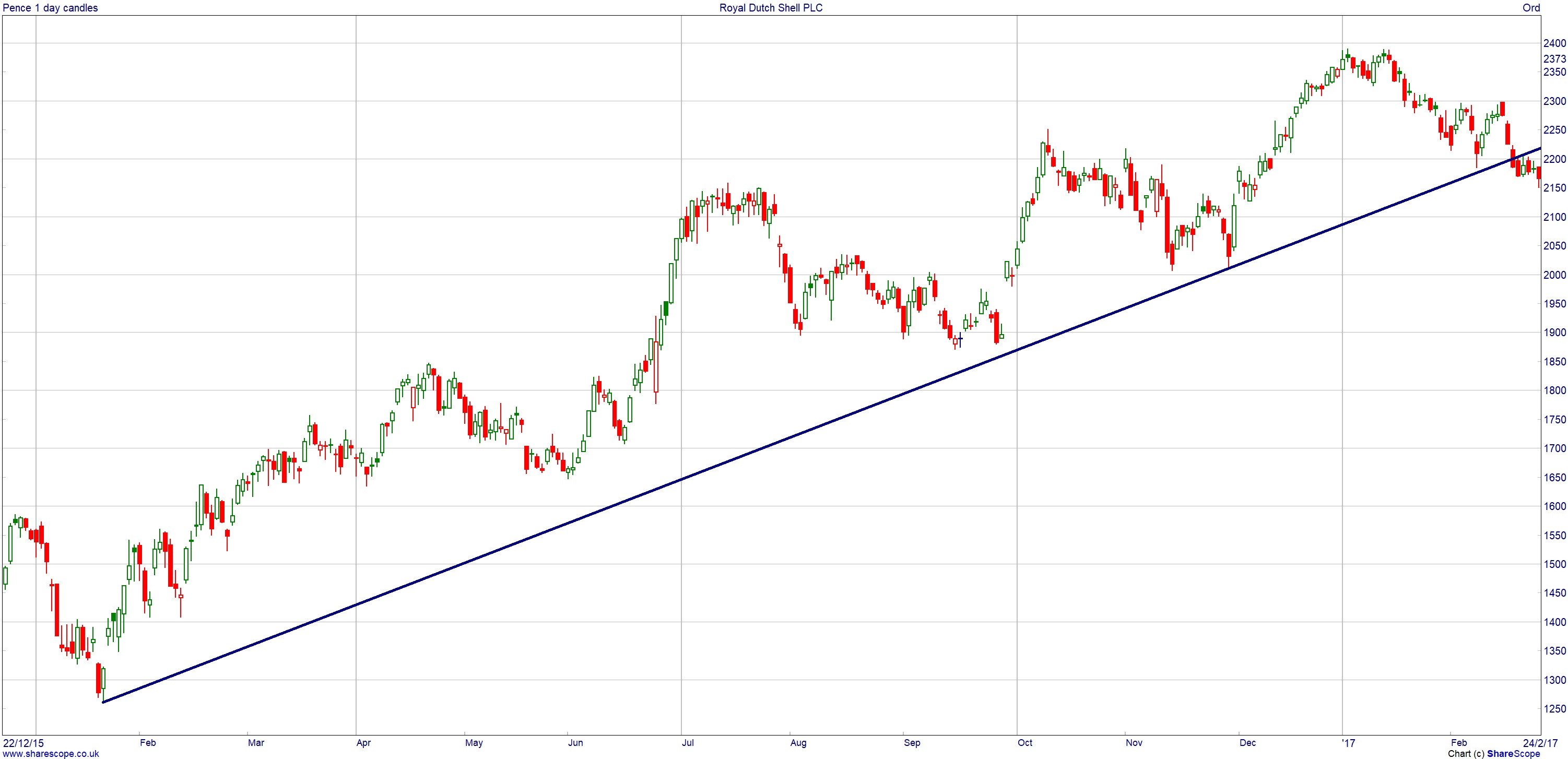
This was a great trend in oil giant Shell (LON:RDSB) that started in January 2016. The trend line is clear to see and there were two to three tests of this, where the price fell back towards it and recovered as expected. These would typically be viewed as buying opportunities. But look what happens in February 2017 – after setting fresh highs for this trend just shy of 2,400p, the price falls back to that trend line. Initially it does bounce – but then turns back down and slips below the trend. This is the classic “break of the trend line” that could suggest the trend you are following is starting to falter and you may want to consider taking any profits.
This approach could be refined – for example you may want to wait for a weekly close below the trend line, or for the line to be penetrated by a certain percentage so you are not just shaken out on a short term “blip” in the price. Either way, a move through a trend line can be one of the first signs that sentiment towards a market is on the turn.
Break through major low
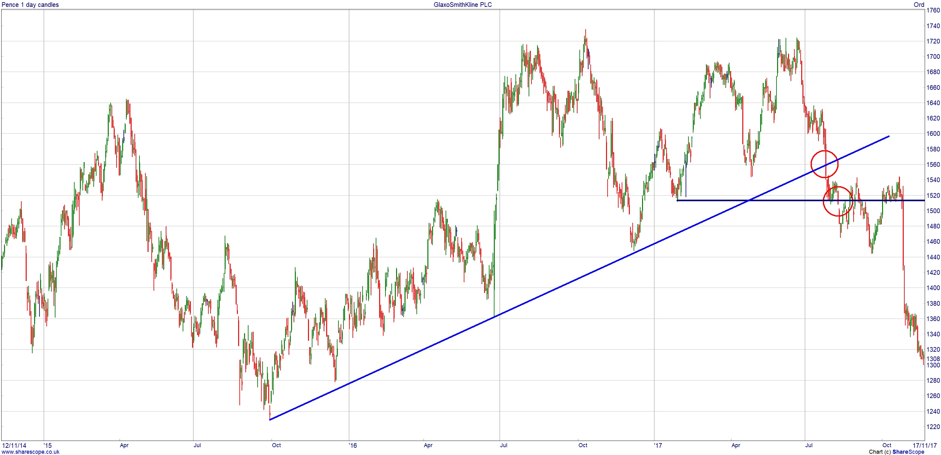
The GlaxoSmithKline (LON:GSK) chart is a good example of combining two approaches when deciding to exit. Previous major lows on a price chart are referred to as support – it’s a zone the price has sold off towards, sentiment has changed, and the buyers have come back in. The text book approach to these is that a break through this support is another sign that sentiment is shifting.
In early 2017, GSK slipped back to the 1,500p area then rallied strongly into the summer, trading back up towards the 1,720p mark. No market moves in a straight line forever of course and the share price turned down once more. But this time around, the old support was broken – a suggestion that things were changing. And interestingly, ahead of this, that trend line from 2015 was the first to break. So in this example there were two clues that perhaps investors were feeling that the price had gone far enough for now.
At this point, I am going to bring back in our very first example – the chart of Shell. Let’s say that rather than looking for the trend line break, we were going to wait for previous support to break before selling our investment.
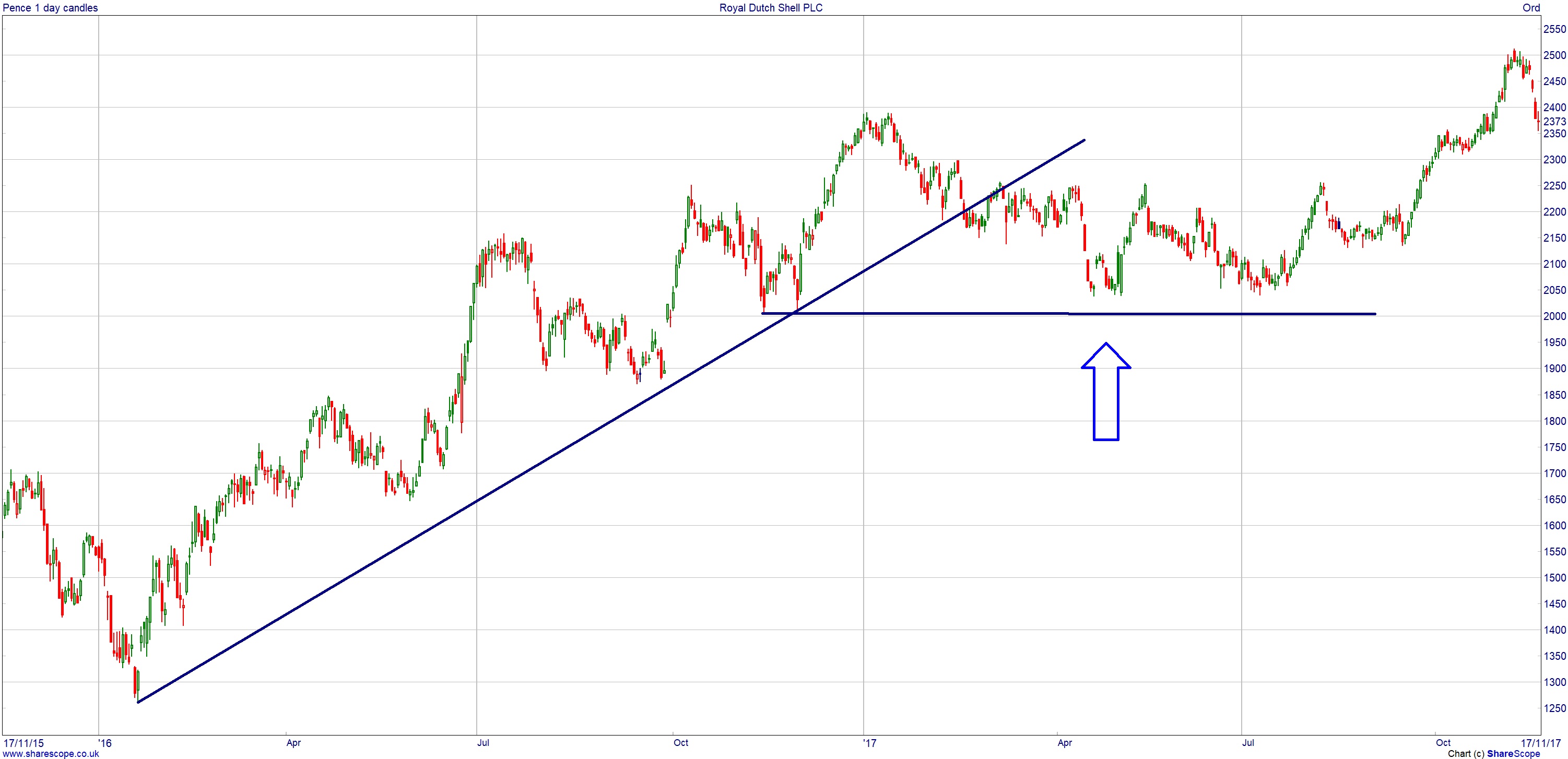
That previous major support never broke. The Shell share price did fall out of the uptrend but just traded sideways for six months, before then going on to start a fresh move higher. I highlight this not to show one approach is better than the other, but rather that no approach is perfect. What is important is that you have some mechanism in place to decide it is time to exit a position.
Failure at previous high
This is a variation on the “break of a low approach” detailed above. We can go back to the GSK chart for an example of this.
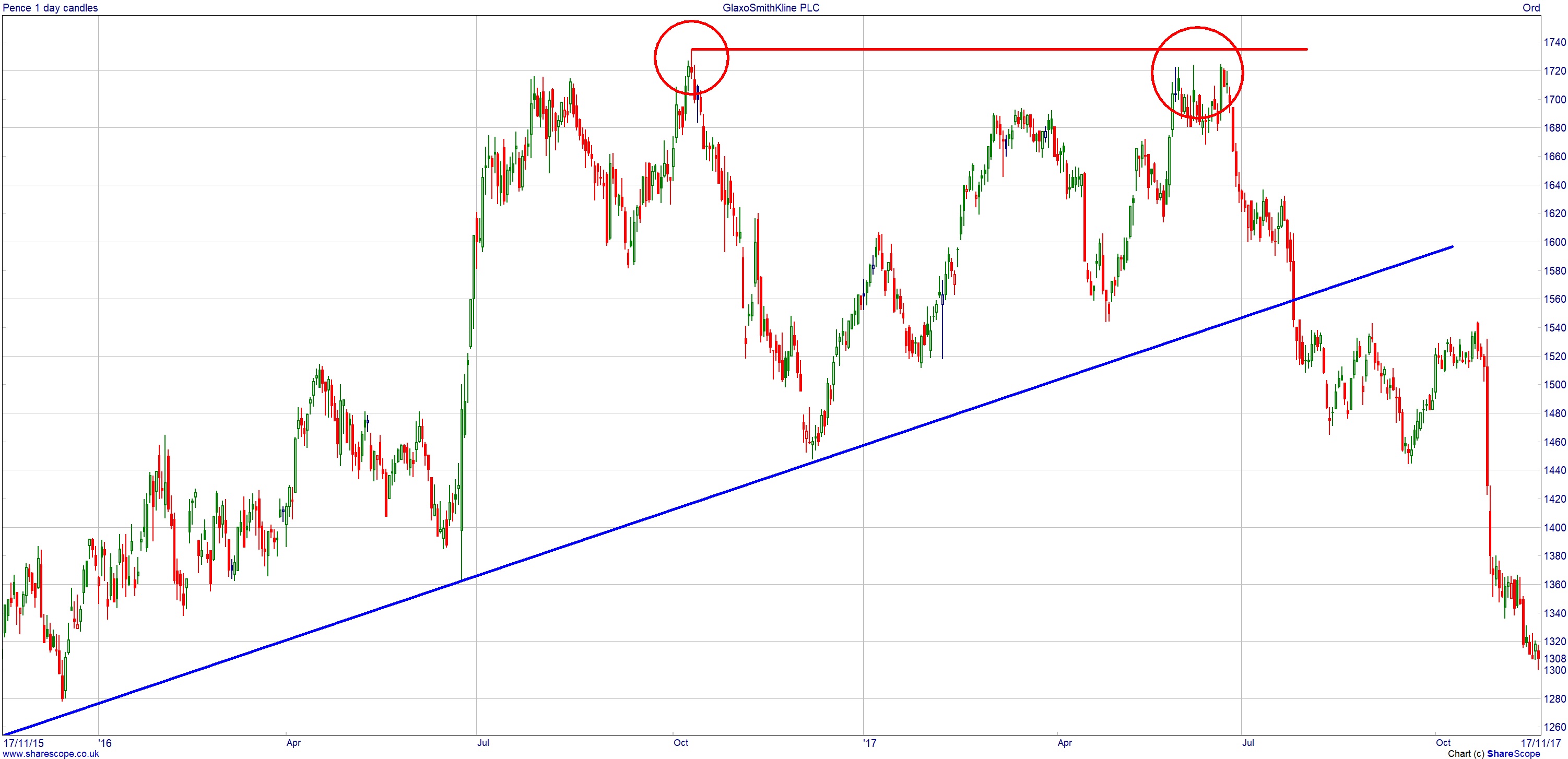
If a market rallies up to a level and runs out of steam then, temporarily at least, the consensus is that it is expensive enough for now. The test is what happens next. In a strong uptrend, when that previous high is approached it could well get broken and the market extends the trend and moves out to fresh highs for the overall move.
But sometimes that previous high turns out to be a real barrier. You can see on the GSK chart above the second move up to the 1,720p area had a few attempts at breaking through – but failed. So if you were in the shares and looking for an excuse to get out at a recent high point, this failure at that previous major high could have been your sign.
Don’t miss David’s next piece in the next edition of Master Investor Magazine – Sign-up HERE for FREE
These are three simple approaches. The usual caveat applies – nothing works all the time, and there is no magic system that does. But given that it is the selling of an investment that realises our profit, the wise investor should spend some time weighing up what will be looked for to suggest this time has come.
Charts of the Month
To turn this on its head to end this month’s article, I thought I would look at two examples, using the approaches above, where the downtrend has ended so could be signalling that a new trend higher could be underway.
Tesco (LON:TSCO)
This one uses both approaches – looking for a trend that has broken and also a move through a previous level that had been something of an obstacle.
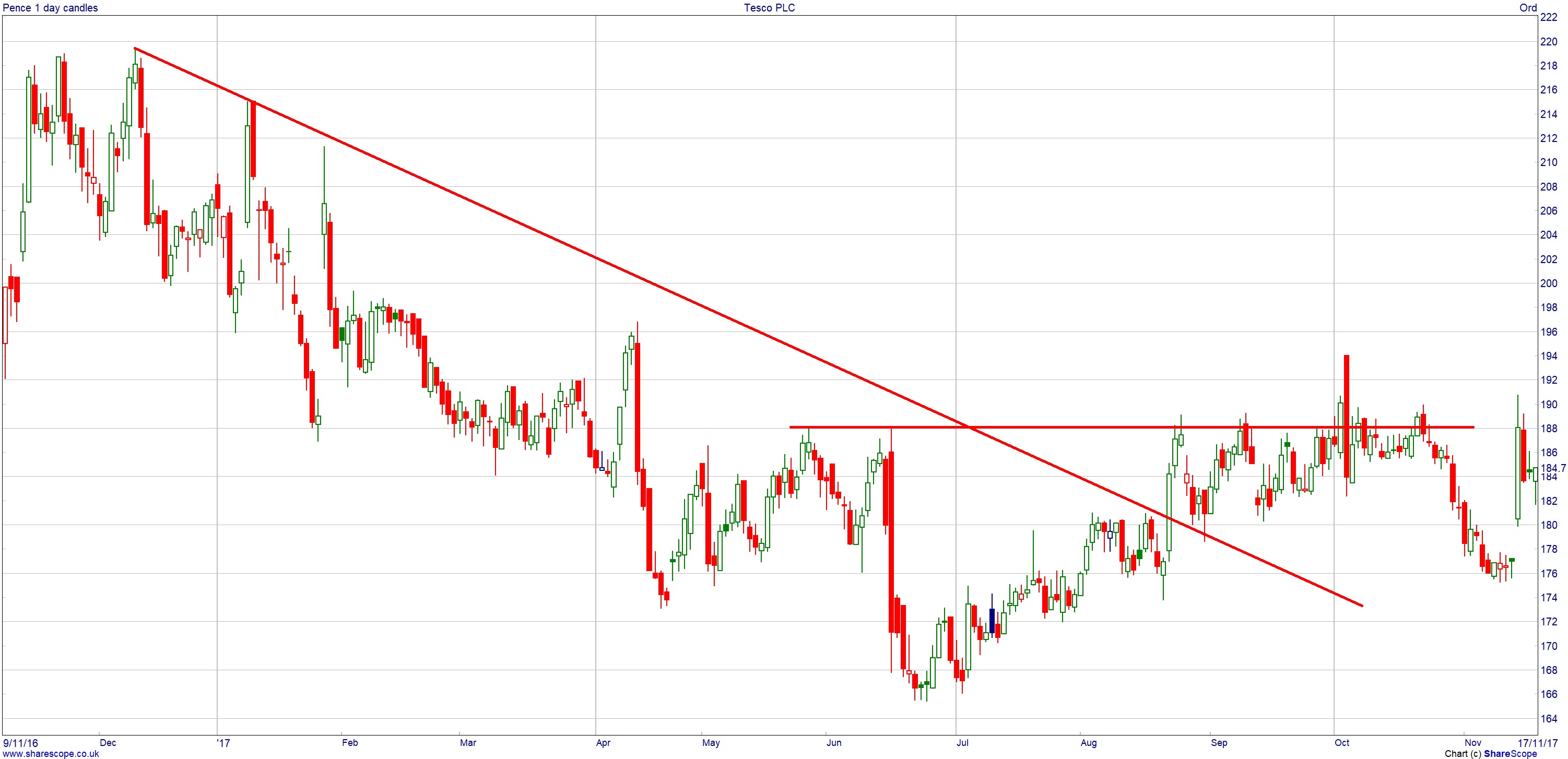
The past year has been a tough one for investors in Tesco. The share price started the year above 200p but had dropped by 15% by the summer. This has left a pretty good downtrend on the chart – look at how the rallies back to the line continually run out of steam. But recent months do suggest that investors could be feeling the weakness has gone far enough. The first evidence of this is that the trend line got broken for the first time in August and the share price rallied up to the 190p area. There has been quite a lot of what is best described as just choppy trading since then, but there does appear to be several probes through that old high around the 190p area. If this really is the start of the turn for the Tesco share price, then the old lows at 165p should not be broken, giving investors an obvious point for a stop loss.
International Consolidated Airlines Group (LON:IAG)
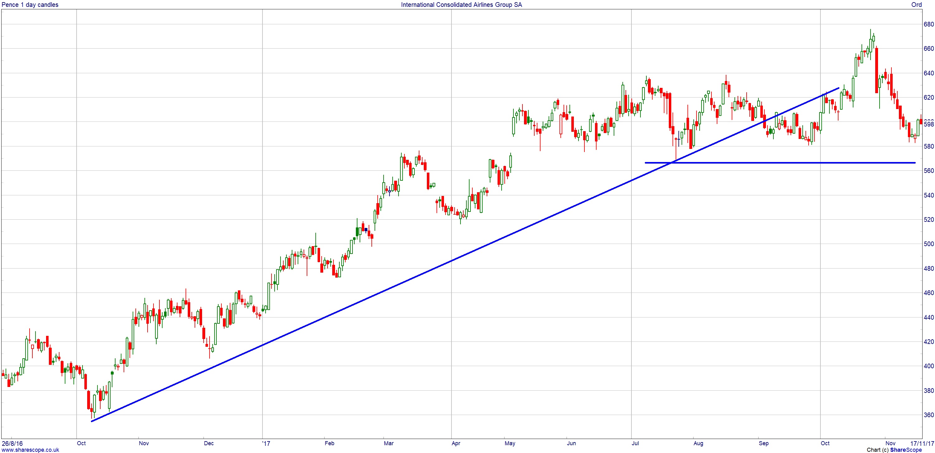
Here is an example that could have wrong-footed an investor on the break of the trend line. IAG is of course the parent company of British Airways, and from October 2016 through to September 2017 the price rose by more than 50%. But that trend line did break in September, perhaps encouraging some to prematurely exit their holdings. They may well have been kicking themselves over the following month or so, as the price moved higher still.
But this did end up being short-lived. Yes, that trend line has broken, but so far at least the big support ahead of 560p has held. So some could just view the trend line break as a slowing of the trend rather than the absolute end of the recovery. Once again, with such an obvious level of support, it does give any fresh investors a very clear level to set up a stop-loss should the IAG price finally reverse.
Comments (0)