Director Index: David Lenigas

As seen in this month’s issue of Master Investor Magazine.
Particularly with start-ups, anything to do with new technology, or exploration in areas like mining, the directors can be key to the operation. Being a regular attendee of the Oil Barrel conferences over the years, I’m familiar with the name David Lenigas, director of seemingly countless companies involved in oil and mining in particular. And I have become interested in a number of the companies he’s on the board of during that time.
You might expect some biographical content here since I’m talking about an individual, but that’s not the case. I know very little about David Lenigas. I understand he’s Australian. I know he’s middle aged. But that’s about it apart from, like me, he could probably stand to go on a diet for a bit.
So what is the article about then? Detailed analysis company by company? Again, no. I wanted a litmus test for Lenigas the director, and I wondered how I could assess him and his ability to spot a bargain, which in turn could be a bargain for me if I bought the shares.
Then why not regard David Lenigas as a company? I could analyse his effectiveness by creating a chart of him. An index of the companies he’s director of, and then perform Technical Analysis on that. Obviously company director information is publicly available. ShareScope also lists directors.
Here we run into all kinds of possible approaches. Should I weight the index based on his shareholding or the capital value of the companies? Perhaps how long he stays a director? I don’t think a lot of those tweaks provide much useful information. I prefer to start with a pretty ‘native’ set of data and then tweak it to focus on particular areas I want to identify specifically.
Of course, you can repeat this exercise for any similar entrepreneur. See the inset for instructions.
How to create a director index
First you need a list of all directorships held. There are plenty of sources for that – just search online. This will return not only the companies that are listed, but also private limited companies too, which can be a bit of interesting reading but not much use in this exercise. Having got your list of companies, make a note of the start and finish dates for his/her time as a director at each. I do this on an Excel spread sheet.
From this list go to ShareScope and download the price history for each company. This can be done equally well using Yahoo Finance.
Start a new tab, or spreadsheet, and list the company EPIC codes along the top, and the dates down the side (using a price history so it excludes bank holidays etc. and will be consistent with the other downloaded price histories, assuming they’re all on the same country’s exchange/s). You then populate the columns with the prices that relate only to the time he/she was a director. NB: Be careful as sometimes EPIC codes are reused. Make sure you have the right price history. INSP is such a case as is STG.
What I’m doing here is treating David Lenigas as a holding company. Now we can start to get to the meat of the act. How good is he, and what is the trend of his activities?
We need an index, so we start with the oldest date, and either use the one company price as 100 to start the index, or once there’s more than one company then use the geometric mean. The FT30 is calculated using the geometric mean. The formula needs to be amended each time there’s a change in the number of elements, or that needs to be allowed for in the formula. I generally prefer an active approach as blank cells have a habit of messing up results by being easily overlooked. I have an extra column for changes in the number of companies. That I call ‘Index Point’ and post the value there which will be the new relative index value for subsequent calculations until there’s another change in the number of directorships, up or down.
Once you have the index values, that column will be the basis of your price history for Director: David Lenigas. You can then import that into ShareScope, or in my case TradeStation (which is an American equivalent), and start to apply TA just as you would for any price history.
Lenigas’ director appointments go back over ten years. That’s quite enough of a history to start making some real conclusions. If you have less than five years you’d have to consider the market conditions. For example, if all the price history exists only in a bull market then you’d have to take that into account. It wouldn’t really give you a full picture as you can’t see if they have any skills at handling adverse market conditions.
Now we aren’t trying to work out how successful Lenigas has been for himself. No account of the number of shares he may have bought or sold, nor any remuneration he may have received, is considered here at all. Unless you want to have a shareholding mimicking his, then it’s irrelevant.
And so we come to the chart. Your chart may differ to mine if you haven’t used the exact same criteria, but as long as you’re consistent it’s a guide, and that’s what we want. Being an index the chart starts at 100. Over ten years later we can say that at 43.91 it’s not a huge success.
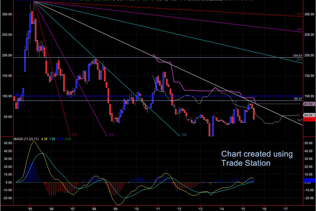
The index 100 level is marked with the dark blue dashed line. A cyan line below that shows the resistance level that the index has touched and failed at twice now. The pink and grey wiggly lines represent the Ichimoku cloud. It’s well below it, and that is a sign of weakness. I’ve put some Gann lines on from the ATH back in ’05. We need Gann to be precise or it’s not working. Few packages have adequate Gann facilities on them and the so-called Gann Fan I’ve used here is not perfect, but it will suffice. The dark red line is marked 1×8 and that is what’s called the first reaction. The 1×4 is ineffective meaning we should expect to see a reaction at the 1×2 and we do. Most recently the second attempt on the resistance level around 90 coincides with the 1×1. To fall back out of the cloud like that without crossing it is unusual. I’d take this as a very weak sign.
Looking back, basically it’s a series of lower highs over the years. A failure (twice) at the resistance level (previously support) at around 194, and then once the cloud kicks in (it needs a lot of data points before it calculates) the price is never above it. The MACD doesn’t look too exciting either. A break above the cloud and that resistance around 90 and I’m interested.
This method is as useful as sector analysis in my view. As I said earlier, it’s not necessarily a reflection of the personal financial success of the individual concerned, but will give you a good idea of the underlying instrument, which in this case is the individual in terms of our ability to buy them as a product.
For the attention of Adrian Kempton-Cumber
Lenigas is a fraudster of the highest order and originally operated out of the Cadbury Schweppes building in Berkley Square London when he was at the helm of his flagship Lonhro……….Gordon Bowden and I have had a long standing High Court Case at the Royal Courts of Justice in London for over 7 years and at long last have won the case which is still open pending costs and damages……..Mr Lenigas and his multiple companies features as part of many fake/virtual oil gas and mining companies…….from our perspective one should form an independent company to vet such “Pie in the Sky” ventures and allow investors to check a company out before parting with their money…..he’s still active in the UK, Africa and Australia and believe me he will continued to be tracked and eventually nailed……You can see an entire series called Pandora’s Box Opens Up More Grime and Slime….the website link below covers the gentleman concerned…….Peter