When to sell: How to use chart signals to exit a position

Most articles on investing or trading tend to focus on where to get in. This can take various guises – whether it is how to spot value, a trend reversal or a market breaking out to new highs. Of course, this is important – but ultimately what decides on the size of your profit or loss is where you get out. It is very easy to become almost wedded to our investment decisions if they continue to move in our favour. But usually no share moves in the same direction forever, so the prudent investor has a strategy for getting out when things change.
| First seen in Master Investor Magazine
Never miss an issue of Master Investor Magazine – sign-up now for free! |

Given the slides seen in stock markets since last summer we could be set for quite a volatile 2019, where plenty of previous star performers continue to struggle. So this month I thought it would be interesting to look at a few chart and technical analysis-based signals that could suggest it is time to cash in our chips.
The change in trend
If we have bought into a share and it is showing a profit, then we must clearly be the right side of the trend. If we are buying low in the hope of selling higher, then the trend has to go up for us to show a profit. Trends can carry on for many years. Just look at the broad stock market trends at the moment. US indices hit fresh all-time highs in 2018 – and this was a trend that started at the end the financial crisis in 2009. When the trend is in our favour, the objective is to ride that trend for as long as possible, to squeeze out the maximum profit from our investment.
But trends do change – market sentiment shifts, and we need to be aware of that when it comes to our own portfolio. The easiest way of tracking this is by using a trend line. Let’s take a look at one of my personal favourite examples of a long-term trend in a share price.
British American Tobacco Chart: 2003 – 2009
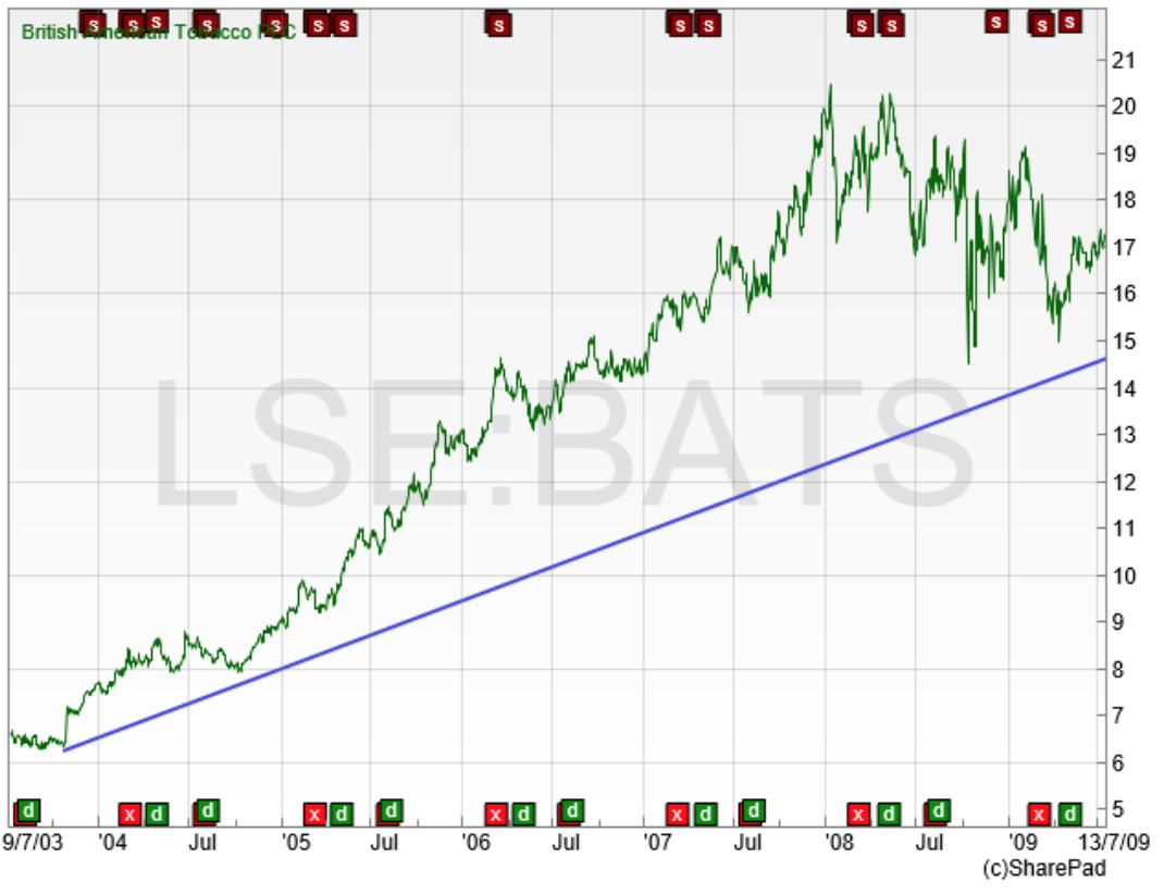
The right-hand side of the chart is the summer of 2009. The share price had already risen from the 700p area in 2004 but that trend was still up leaving British American Tobacco (LON:BATS) trading at 1,700p five years later. From a simple trend following point of view, the assumption was that the trend would continue – until it did not any more. It always seems obvious to say something like that – but it’s the truth. Trends can run much further and much longer than we expect them to. An investor in British American Tobacco in 2009 would feel comfortable about hanging onto the shares, as there was nothing to suggest that the trend had changed. But as previously mentioned things do change – and good investments fall out of favour. Let’s bring the chart up to date.
British American Tobacco Chart: 2003 – 2019
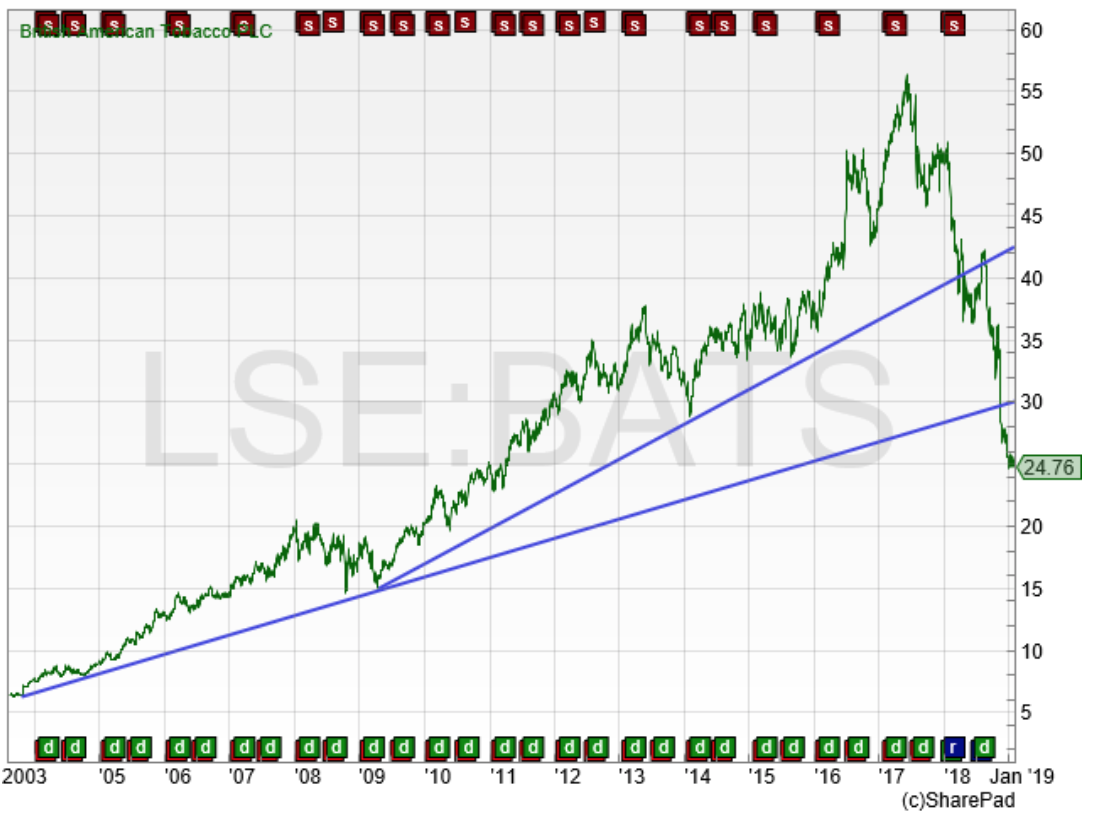
Eventually the British American Tobacco share price hit an all-time high of 5,600p in June 2017. That longer-term trend was still valid – but from 2009 the price accelerated, so that is why I have drawn a sharper-angled trend line on the chart. That shorter-term trend line was broken in March 2018 as the share fell back to the 4,000p mark. The trend line from 2003 eventually broke at 3,000p in November 2018. Either way, longer term sentiment had clearly shifted against BATS.
Now, personally, if a share I was holding had hit 5,600p, I would not be too happy to wait and watch it fall all the way back to 3,000p before deciding to get out. That’s where I think the sharper trend line comes into play here. I would have wanted to be out a long time before that 15-year trend line broke, otherwise I am just giving up far too much profit, assuming I have held for many years. The trend line approach is not perfect (what is?) but it is worth paying attention to when it comes to aiding the decision about whether it is time to cash in our profits.
A more objective approach: the moving average
| First seen in Master Investor Magazine
Never miss an issue of Master Investor Magazine – sign-up now for free! |
I have titled this “more objective” – but that doesn’t necessarily mean it is better. It’s a variation on the trend line tactic, but again a price move below a moving average can suggest that sentiment is changing.
A moving average is a really simple calculation. For example, a 200-day moving average simply totals up the last 200 days’ closing prices, divides by 200 and comes up with an average value. This is repeated every day and the line gets plotted on the chart. A rising moving average means that the average price is obviously increasing; the market is in an uptrend. Many will use a fall below the moving average as a sign that trend is changing.
Popular moving averages in the stock market are 200-day and 50-day. Once again there is no perfect answer here as to which is the “correct” value to use. A shorter moving average like a 50-day will get you out of a falling share quicker – but will be more susceptible to false signals with market volatility. A 200-day moving average will keep you in for the long haul – but will get you out later when a trend finally changes. Let’s take a look at an example.
HSBC May 2016 – April 2018 with 200-day moving average
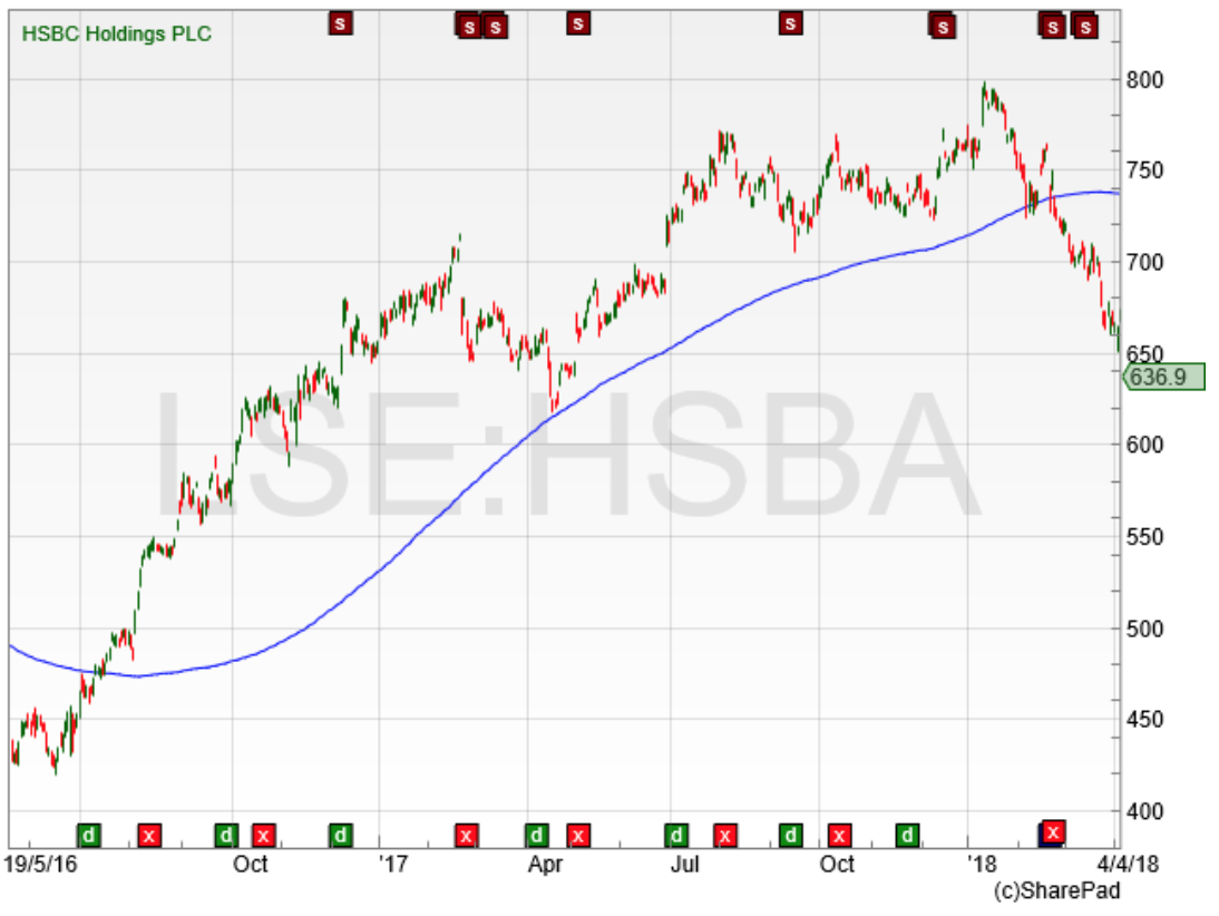
Assuming our investor bought into the shares around the 400p mark in the summer of 2016, the HSBC (LON:HSBA) share price did not fall below the 200-day moving average, the blue line on the chart, until February 2018 when its share price was around 720p.
None of these approaches are perfect – but investors should have a strategy for getting out when sentiment changes. Profits built up over years – but not yet realised – can disappear very quickly if a share falls out of favour.
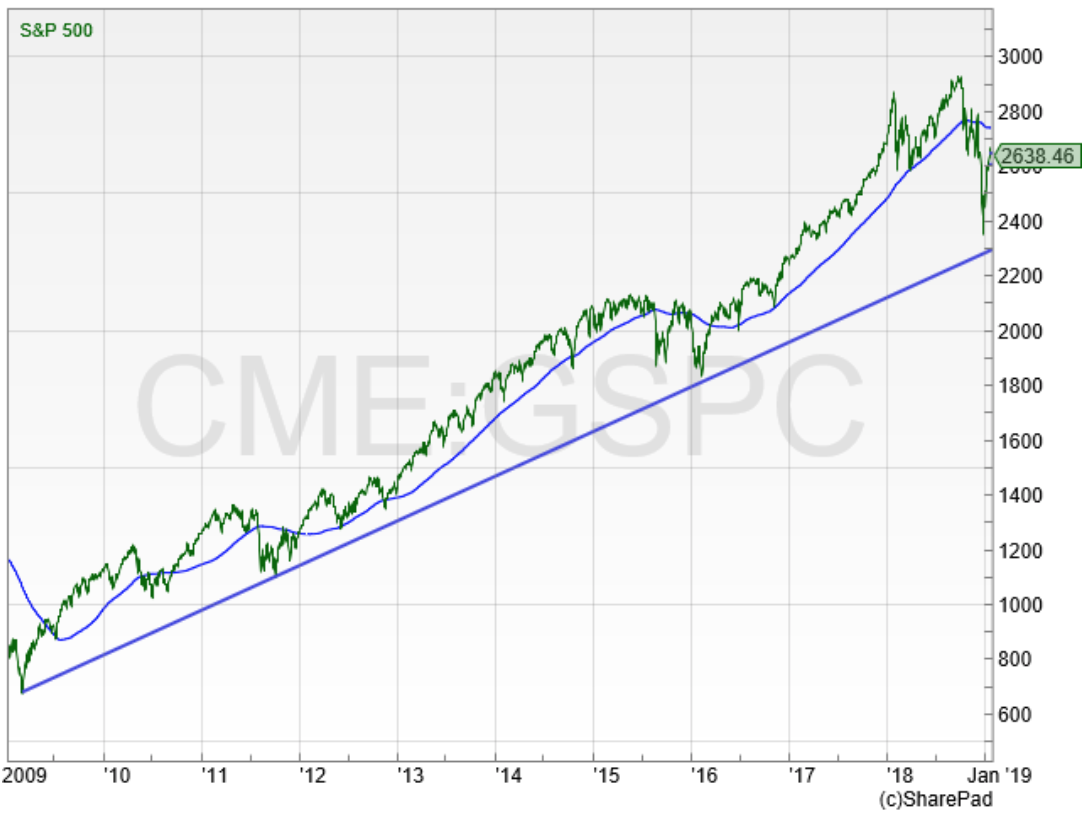
To wrap up this section, let’s take a look at the broader US stock market index, the S&P500, with a trend line and 200-day moving average applied.
US S&P500 index: 2009 – 2019
| First seen in Master Investor Magazine
Never miss an issue of Master Investor Magazine – sign-up now for free! |
I think this is a really interesting longer-term view. It starts off from the low set at the bottom of the financial crisis bear market (666 for conspiracy theory fans….). It can be seen that even though US stocks had a torrid time towards the end of 2018, the sell-off did not take out that longer-term trend line. The moving average had been broken a few times – but the move below in October last year was the first time the index had broken the 200-day moving average since the summer of 2016. That big trend is still up – but if we saw US indices move below last year’s low it does start to look as if the ten-year trend is finally in trouble. I think we have some interesting months ahead for stock markets.
Chart of the Month
Given that this month is all about trends and moving averages, I thought it would make sense to find a share in the FTSE350 that is still positive based on both of these approaches.
A G Barr
Investors in A G Barr (LON:BAG) have been impressively immune to the market volatility the rest of us have experienced in recent months. Since the beginning of 2017, its share price is up by more than 50%. It ended last year at an all-time high and for now at least the recent trend looks to be intact.
AG Barr September 2016 to 2019
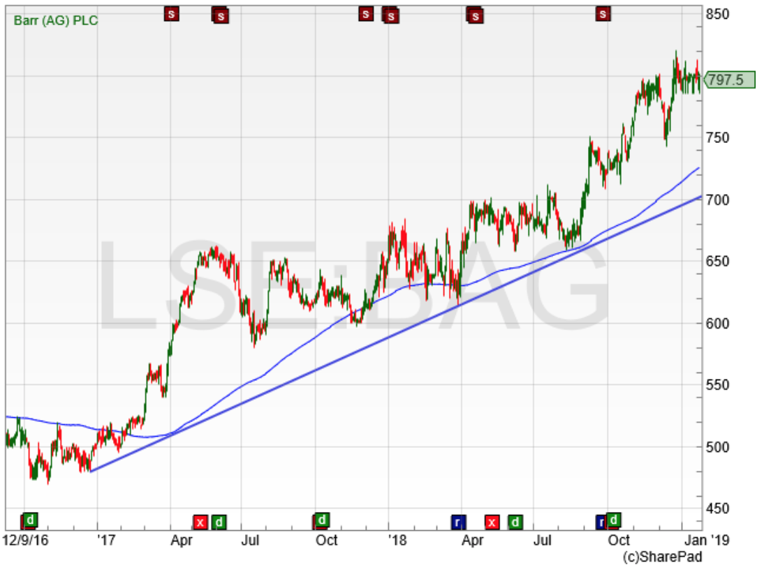
The performance of the soft drinks brand behind Irn-Bru is interesting for a couple of reasons. As mentioned, it has done an admiral job of sidestepping the volatility. But it is also above the 200-day moving average and the trend line – and at the moment these are coming in at a fairly tight zone on the share price chart. At the beginning of 2019 the trend line was sitting right on the 700p level and the 200-day moving average is at 725p. So a longer-term investor in the company has an obvious area to watch if sentiment changes. If the price slid below 700p then both the moving average and the trend line would be broken and sentiment could well be on the turn. It will be an interesting share to watch in 2019 to see if it can continue to defy the broader market worries.
Comments (0)