Inverted yield curve: is financial Armageddon just around the corner?

| First seen in Master Investor Magazine
Never miss an issue of Master Investor Magazine – sign-up now for free! |

The inversion of the yield curve – a reliable predictor of imminent recession – has put the financial world in a flap. Is this a cause for concern? David Jones takes a closer look.
The financial media loves a bit of drama and hyperbole. At the time of writing, the headline-grabber of the day is the inversion of the yield curve and worries about a recession just around the corner. This month, I would like to take a look at this in more detail, with a particular focus on whether this means major reversals across the board in financial markets – or whether everyone just needs to calm down a little, and that it will be business as usual after the summer ‘wobbles’.
What is the bond yield-curve inversion?
In layman’s terms, the interest rate on 10-year US government bonds has dropped below the rate on the two-year (shorter) bonds. The punchline for this somewhat dry fact is a little more attention-grabbing – historically this has happened ahead of seven previous recessions.
To put it into context, if you look at savings accounts, you will probably notice that they typically pay more for locking your money up over the longer term than if you decide to have an instant-access account. The clear implication here is that a longer lock-up implies more risk. But what we are seeing in financial markets is that the situation has actually reversed. It is a rare event, but it does happen. Shorter-term interest rates are higher than longer term, suggesting investors are somewhat ‘spooked’ by what lies immediately ahead for markets. Add in the fact that historically this inversion has occurred ahead of every US recession since 1955, and it is maybe not toosurprising that we saw steep falls in the likes of the Dow during August.
Bad news sells papers – or perhaps more appropriately in the modern world, it garners clicks. And the 100 percent predictive record of this event is a hard one to argue with. But even when economies have had a downturn, it has typically taken around 18 months to materialise after this inversion occurs. Nevertheless, forewarned is forearmed, so it seems a good time to catch up with some of the major markets and see if they could be at significant turning points.
US Dow Jones Index
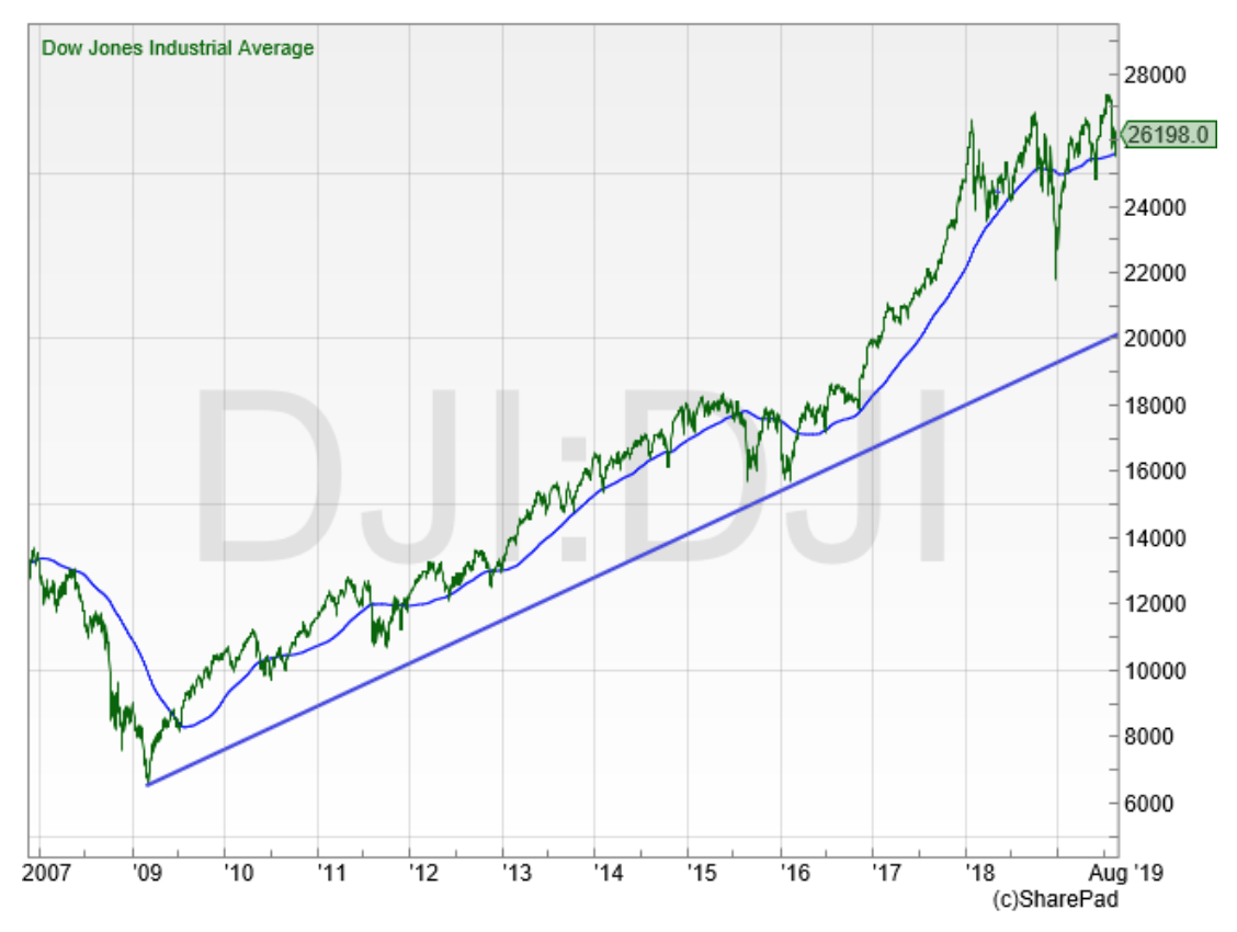
It is more than 10 years since this US stock-market index set its financial crisis low. That came in just below the 6,500 mark in March 2009 and since then the popular benchmark has risen more than four-fold. This July saw it hit fresh all-time highs once more – which is normally seen as a demonstration of strength in a market. But there was also plenty of volatility during August, with the Dow dropping back by more than 7% by the middle of the month.
However, looking at the long-term trend and the 200-day moving average, there does not appear to be an awful lot to be too concerned about just yet. It could be argued that a 10-year plus bull market is admittedly somewhat ‘long in the tooth’ by historical standards, but it is still a long way away from that major trend line which comes in around the 20,000 mark. US stocks have experienced plenty of bouts of volatility in recent years, only to bounce back higher once more. For now at least, there does appear to be the appetite to continue to be a buyer on dips, with major weakness seen as an opportunity rather than a threat.
UK FTSE All-Share
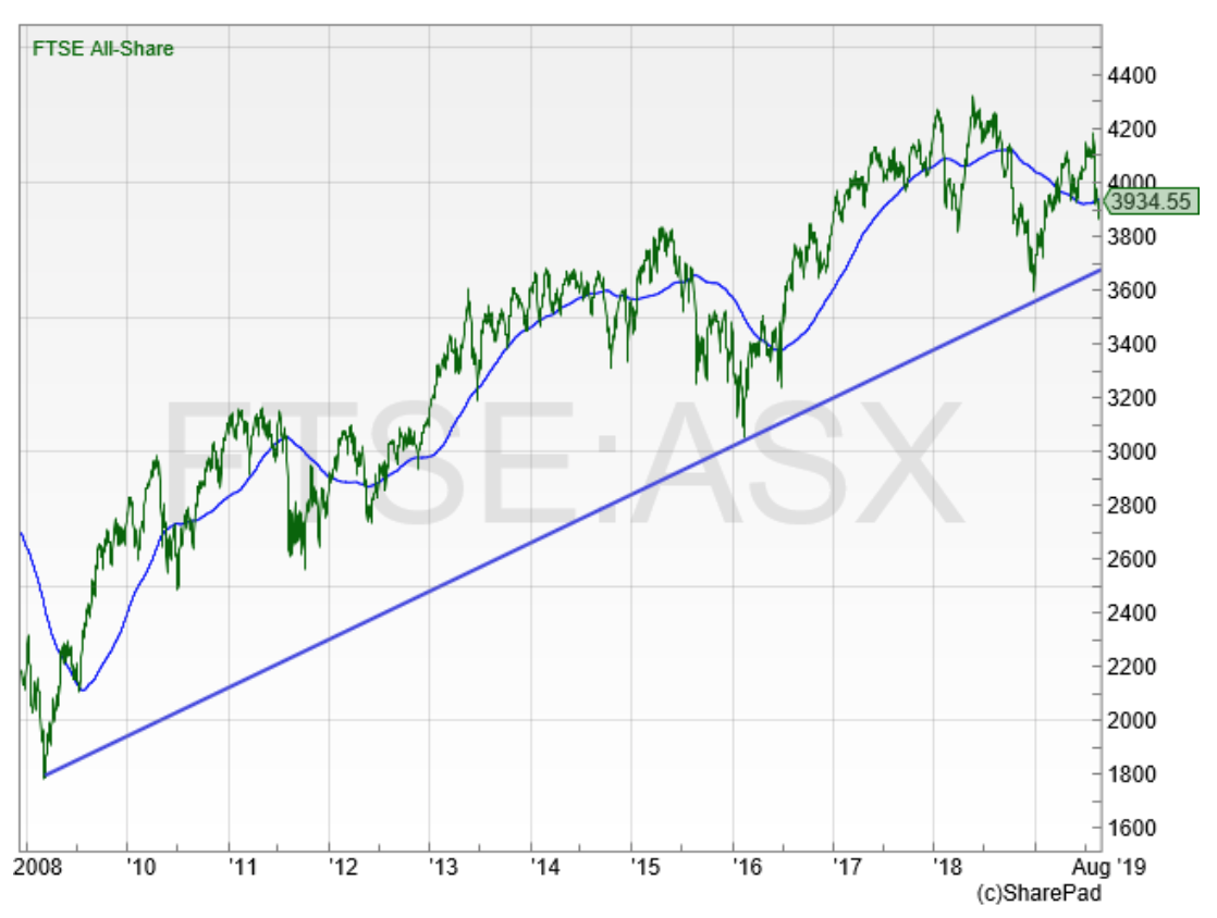
It is a similar, if not quite as bullish picture for the UK’s broad market index, the FTSE All-Share. Momentum has flagged here somewhat: it has been more than a year since this index set fresh all-time highs −although like the Dow Jones it is still above that trendline that dates back more than a decade. August saw the All-Share dip below the 200-day moving average, the first time we have seen a sustained move below this indicator since the last quarter of 2018.The more aggressive investor would see this as just another opportunity to buy into weakness.I would also be inclined to take that view −for me, only if those late 2018 lows in the 3,600 area start to get breached does it look like it is time to worry about that longer uptrend finally changing.
Brent crude oil
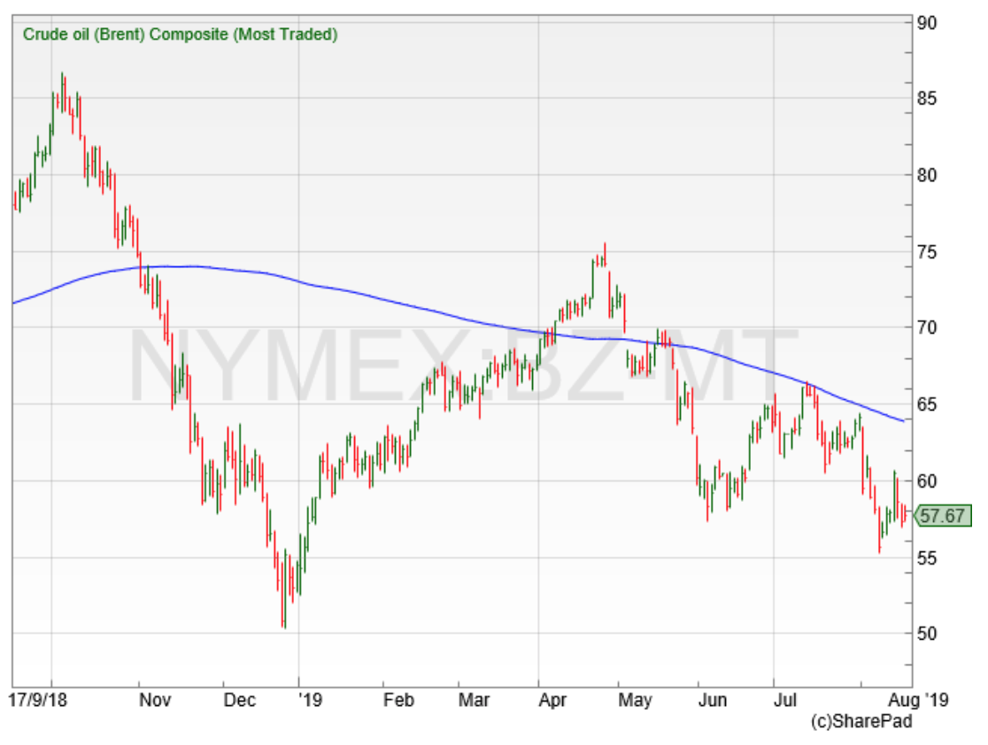
If there is one commodity that is more vulnerable than most to concerns about the prospects for economic growth, then oil is surely that market. If it seems as if the global economy is about to ‘catch a cold’, oil traders are very quick to hit the sell button. If retail spending levels drop, then factories slow down and less goods are transported – with an obvious knock-on effect in demand for fuel. Bearing all this in mind, it is not surprising that the many mentions in August of a coming recession saw the oil-price drop more than 10% in fairly short order.
Oil has always been a volatile commodity. From late December 2018, it had bounced back by more than 40% as April 2019 drew to a close. Admittedly, it has lost a lot of positive momentum since then but for now at least seems well-supported ahead of the $50 a barrel area. I think it will be a long time before it is trading back at the heady heights of $85 seen in 2018 – but as with other markets at the moment, buyers seem happy to step in on sudden drops.
Gold
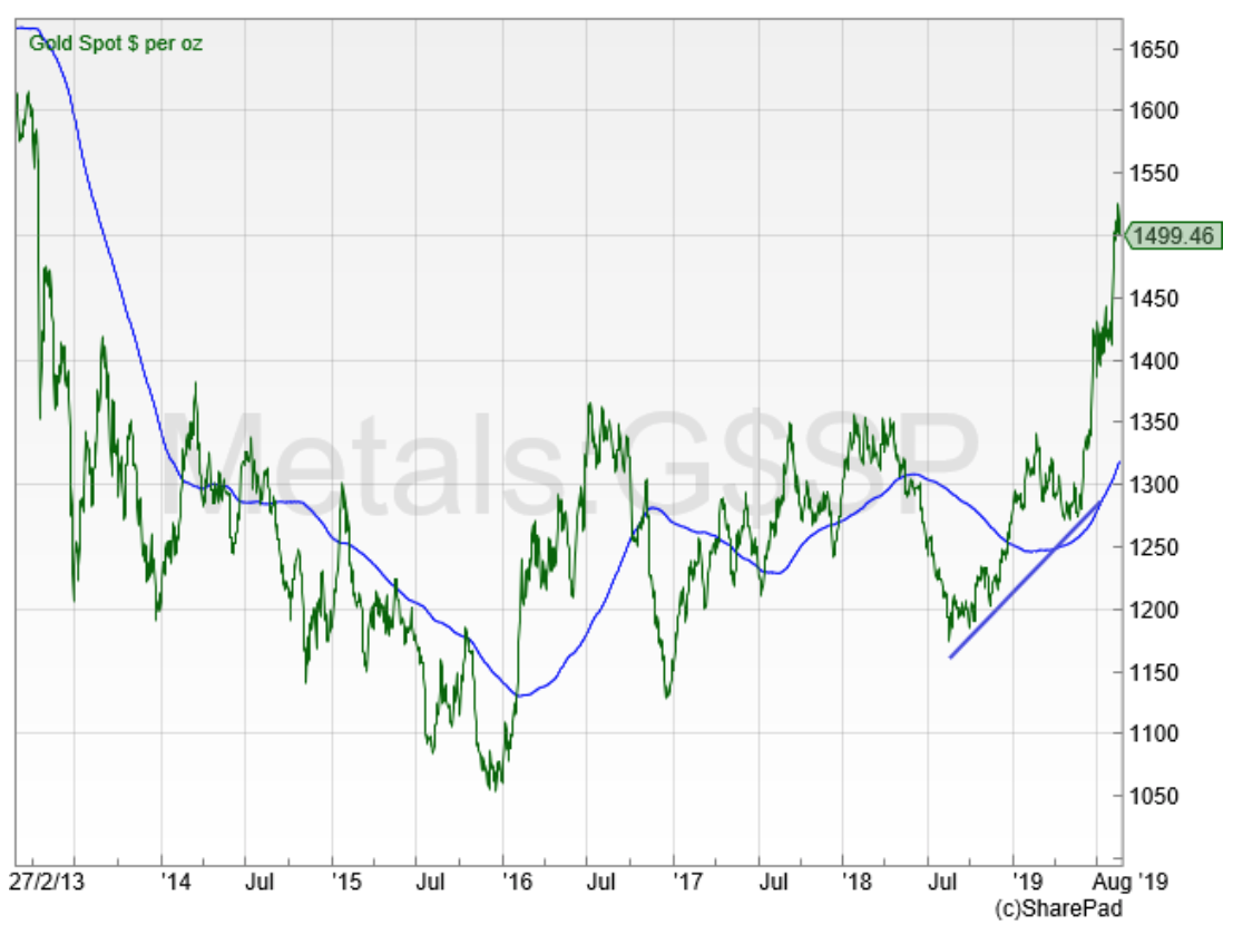
And finally, gold. If financial-news services like a crisis, then ‘gold bugs’ positively love them! I have written about gold already this year as it had been in a recovery since the 2018 lows. But talks of trade wars and inverting bonds have boosted the price in recent months. From June till mid-August, gold rose by more than 15% as investors sought a relatively safe destination in the face of all these potential threats.
As a committed trend follower, I am still bullish on the price of gold medium term. But I do just wonder if maybe in recent months the price has got a little ahead of itself, helped along by all this gloomy talk and a slightly weak US dollar. Gold has hit six-year highs and could definitely stand a ’healthy correction’ of a few percent from its current elevated levels.
Should investors be worried?
Back to that inverted yield curve. Clearly a lot of investors are concerned, otherwise it would not be inverted. It has undeniably predicted economic slowdowns with great accuracy −and stock markets in particular have been rising for a long time. But there has been a lag in the past between this signal occurring and economies suffering. For now at least, I think there could well be a little more fuel left in the tank when it comes to the upside for global stock markets.
Chart of the Month
I thought we would stick with the overall theme this month and take a look at a broad market asset – the London-listed iShares S&P500 tracker.
iShares S&P 500 (CSPX)
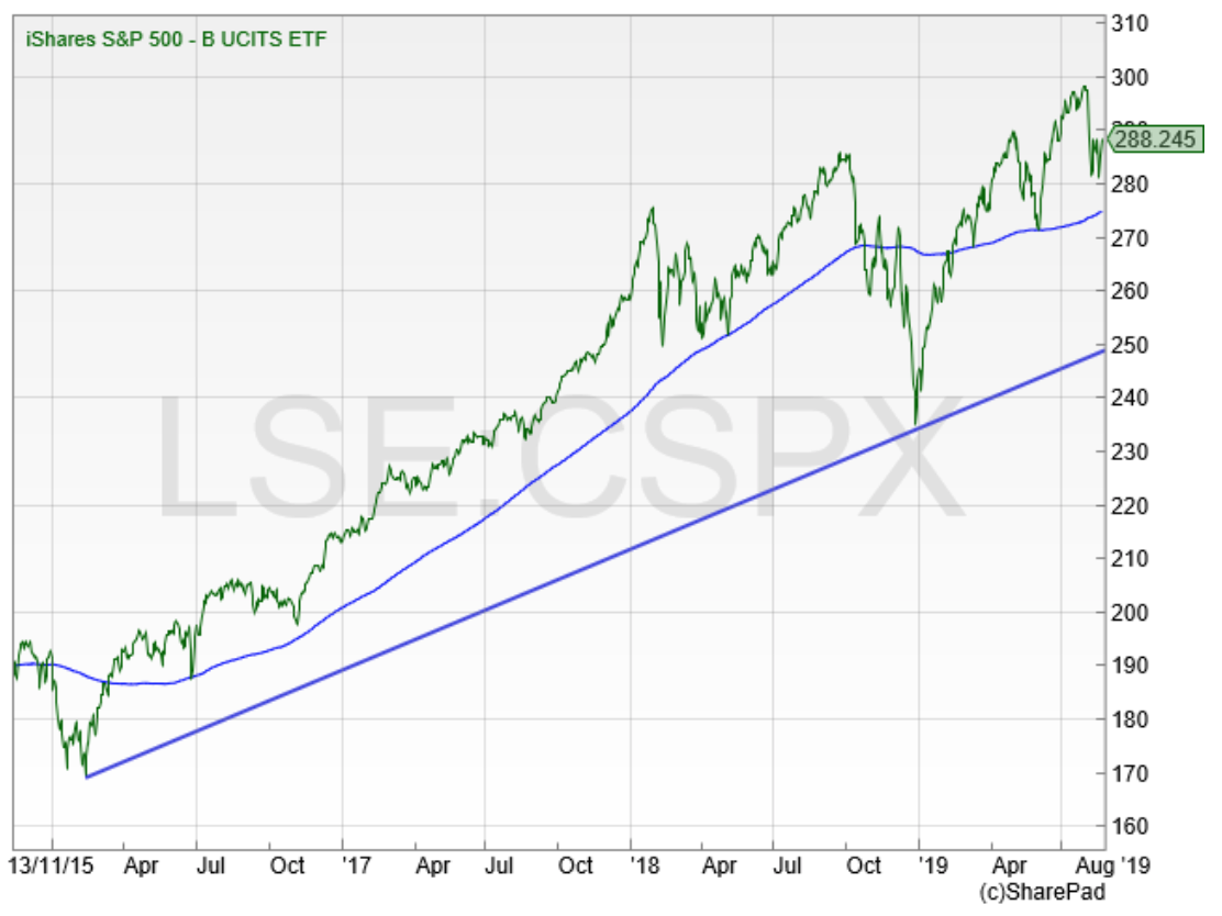
I always think this is an interesting exchange traded fund – and something I have made various purchases of over the years. Put simply, it tracks the US S&P500 index – a much preferred index by many when compared to the Dow Jones, as it has a wider mix of stocks (although the performance in reality does not differ that greatly). This S&P tracker is quoted in US dollars so as a UK investor you do have the currency risk – although that has been working in our favour recently with the pound dropping versus the dollar.
I have picked up on a closer trend in the chart, from the 2016 lows. That is currently coming in around the $250 mark and there is also good support ahead of $230, the lows from December 2018. For the investor that wants to fly in the face of the fear around the inverted bond yield, then this asset is clearly an interesting one to easily get wider exposure to the broader US market performance, without having to drill down into the detail of looking into individual US-listed stocks.
Comments (0)