Charting is wonderful – so why do so many people still lose money?

Ex-IG Chief Market Strategist David Jones asks why so many people lose money when they trade, with examples of how not to lose money when trading the S&P 500.
| First seen in Master Investor Magazine
Never miss an issue of Master Investor Magazine – sign-up now for free! |

For this month’s section on charting and technical analysis, I thought I would come at it from a different – but in my view, very useful – angle. Over the months, we have looked at various aspects of charting and technical analysis: the idea of patterns such as double tops; simple mechanical approaches like moving averages; and the world of the various technical indicators such as stochastics. And of course, my own personal favourite – which is a message I regularly try to bang home – trading and investing with the trend.
I think it’s fair to say I am a big fan of the charts – whether it is trading or investing, I don’t make a decision without consulting them. For the past 15 years or so, I have worked in the financial trading business, for companies who provide instruments such as contracts for difference (CFDs) and spread betting. These products allow you to take speculative positions on a whole range of financial assets from around the world – whether it is individual shares, indices, commodities or currencies. But it’s no great secret (particularly now, since the regulator requires that companies disclose what percentage of clients have lost money) that most people are not profitable when it comes to financial trading.
In this month’s article I am going to look at a way of using charts that can hopefully help to tip this balance in your favour, if your experience has not been a positive one.
The number one reason most people lose money when trading
In my experience, many short-term traders using CFDs and spread betting also use charts when it comes to deciding whether they are going to buy or sell. And most of them are losing, ergo charting must be rubbish.
Not so fast. There was a very interesting study done by a US foreign exchange broker between 2009 and 2010. This looked at 12 million trades carried out by its clients, who were retail traders like you and me. As an average, more than 50% of these trades were closed out for a profit. To pick on a popular currency pair, the euro/US dollar rate (EUR/USD), the success rate of trades was 59%. So almost six out of ten were closed for a profit.
At this point you may be scratching your head. If most trades are being closed for a profit, where are all these losing traders coming from? Well, being profitable is not about being right most of the time. Of course, if your profits and losses were equal, you would still come out ahead – but that is not the case in the real world. This study found that, on average, if a trader made £100 on a winning trade, the average loss on a losing trade was £180. You have to be right an awful lot more often than half the time to make that work.
How can charts help us tip the balance?
I have mentioned this concept a few times in the past, but it always bears repeating. As the numbers above show, trading is not an intellectual game where you get a prize for being right more often than you are wrong. It’s about making a profit. So, when looking for opportunities we should be trying to identify trades where the potential profit is a multiple of our potential risk.This is just as true for investing, just probably more so in the shorter-term world of trading where there is usually more activity – and clients can see their account balance diminish much more quickly. Here’s an example of a recent trade I did:
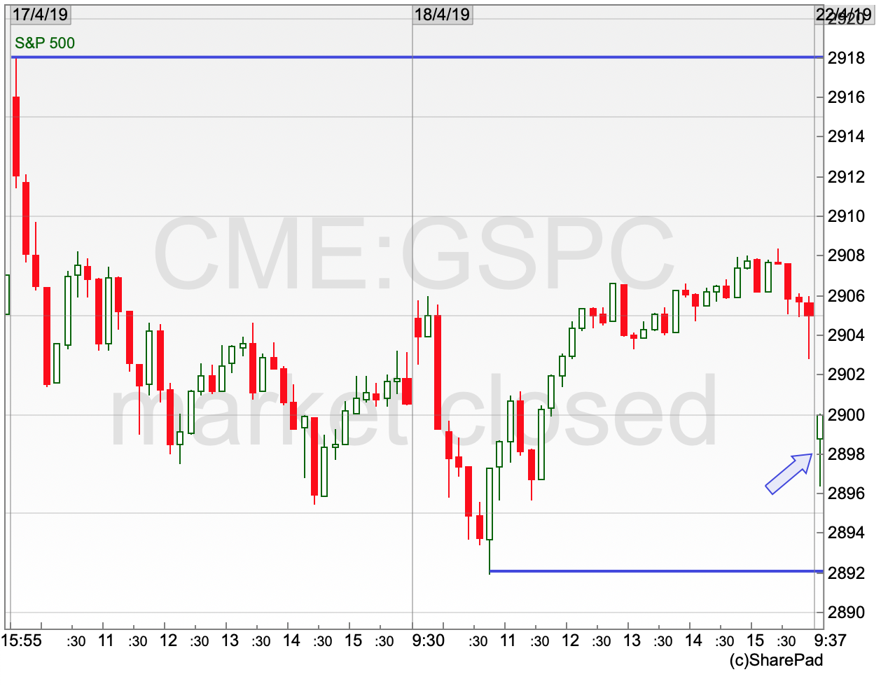
S&P500 Chart 17-18 April 2019
| First seen in Master Investor Magazine
Never miss an issue of Master Investor Magazine – sign-up now for free! |
I think we all know the markets have been on something of a rip higher this year, staging a frankly incredible comeback since the lows set in December. Buying into the odd sell-off has been something of a no-brainer strategy so far – and of course it is trading with the trend in the market.
On 22 April the S&P500 index opened lower but held above the lows for the last couple of days in the first half hour. These lows were an obvious reference point for a stop-loss for a short-term trade – if the lows were taken out then the trade could be closed for a manageable loss and wait to see what happens next. I ended up buying in at 2,900 with a stop loss at 2,890, just the other side of those lows. If the uptrend was going to continue then a target that was not too audacious was for a run back up to the highs of a couple of days ago, at 2,918. This is using simple support and resistance levels to weigh up whether a trade is really worth taking, regardless of your overall view of the market.
In this example, the risk on the trade was 10 points, and the initial potential profit was 18 points. It’s not the greatest risk versus reward set up – but at least the potential profit is a multiple of the risk, rather than the other way around. Let’s see what happened next.
How the trade worked out
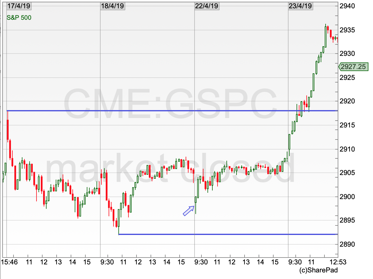
On the day the trade was placed, the market recovered slightly but nothing too dramatic. The same can’t be said of the day after! I will hold my hands up to this being something of a fluke – but it is a real trade I did based on the risk/reward being initially attractive. In the end the trade realised a profit just slightly more than three times the initial risk.
Unfortunately for my bank balance, not all trades turn out this way. But by avoiding the 50/50 “bets”, for want of a better word, you can help tilt the probabilities in your favour, from an investing or trading point of view. So, if it is this straightforward, why are so many people still losing when it comes to trading? I think there is more than one reason for this, but the fundamental problem (as covered at the beginning) is that the average person takes profits too quickly, and lets losses run too far. They are a fugitive from the laws of mathematics!
Waiting for the right opportunity, then rigidly sticking to a stop loss and letting the profit run takes discipline and patience– something that tends to be in short supply, particularly amongst newer entrants to the world of trading and investing. Focussing on these two points will deliver real benefits – far more than worrying about what colour moving averages to use or how many Fibonacci lines you should have on a chart!
Chart of the Month – S&P500
I thought we would continue our US index theme when it comes to the chart of the month, as it is near a really key level. I really like the S&P as an index to watch – it’s a great US benchmark and it consists of 500 stocks rather than just the 30 that make up the Dow Jones. Let’s remind ourselves of the bigger picture.
Ten years of the S&P500
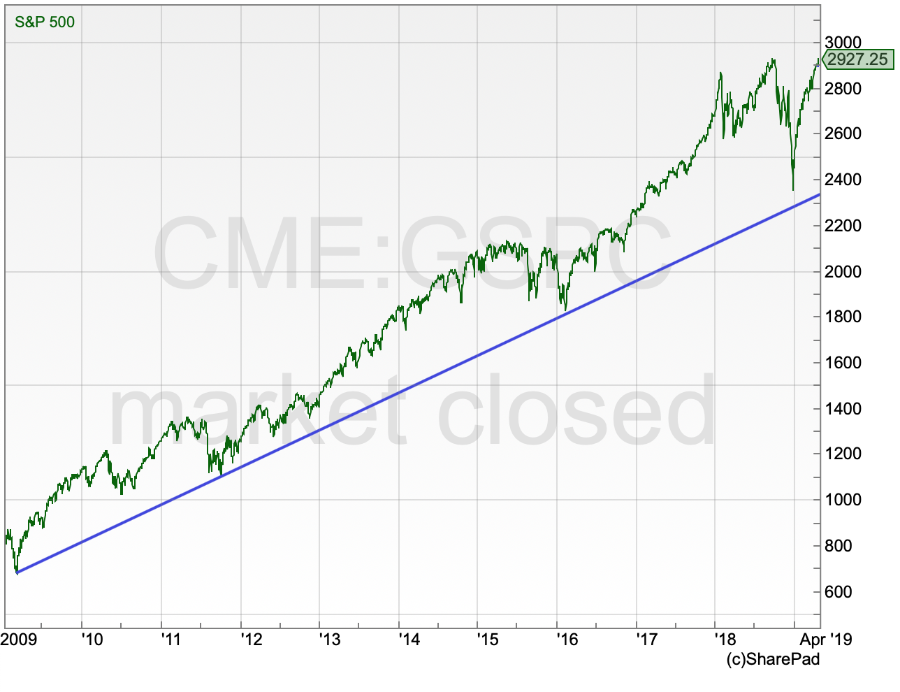
This chart starts at the lows of the financial crisis – remember that? And can you spot a trend? What is interesting here is that the plunge in the last quarter of 2018 still held above that longer-term uptrend which is currently coming in just below the 2,400 mark. The index has had a remarkable bounce back since then.
The last eight months
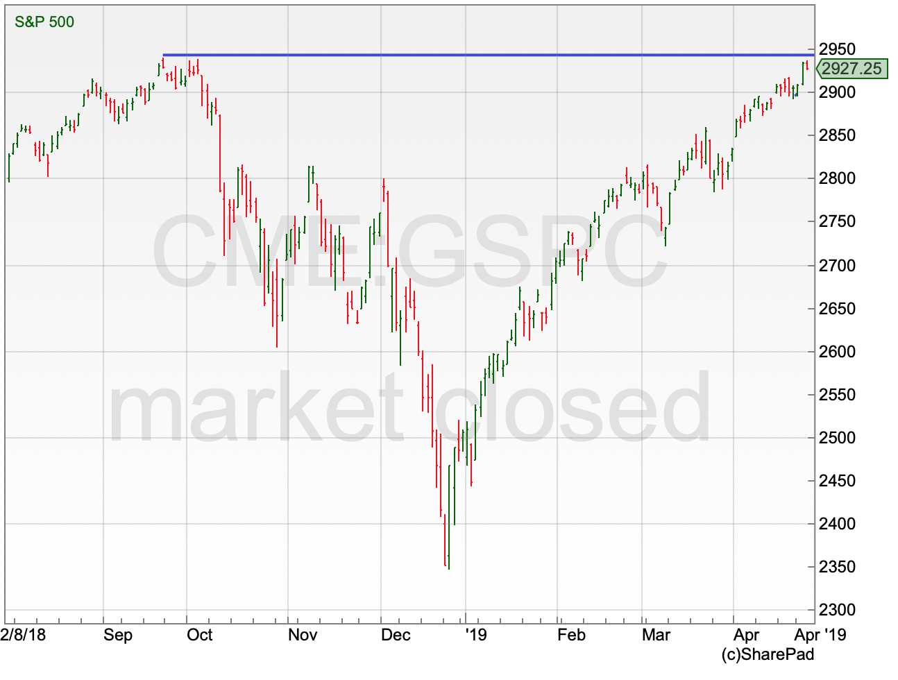
If you had been living off the grid since last summer, upon checking the price of the S&P you would think it had been an incredibly uneventful time. Of course, nothing could be further from the truth. Markets experienced a significant decline into the end of 2018 – the Dow had its worst December since the Great Depression! The subsequent recovery has been just as relentless and has brought the S&P back to within a whisker, at the time of writing, of its all-time high at 2,941.
Put bluntly, it is break or bust time. A sustained move through this old high would be the classic “chart breakout”. An old barrier has been breached and the expectation would be for a new trend to be underway. The flipside of this is that the market is back to an area where last time around, in September, the sellers came out taking the view that the market was overvalued and down it went. Either way, it should be an interesting few weeks ahead – place your bets.
Comments (0)