Using Corporation Tax as a Technical Indicator

As featured in this month’s Master Investor Magazine.
As Technical Traders we’re always looking for an edge in identifying trends and buying/selling opportunities. Typically, we use indicators based purely on price. The other possible element is volume, although it’s overrated as a tool in my view, and most of the time offers no help at all. This is one of the difficulties of technical trading: knowing which indicators – or more correctly, which combination of indicators – are of value at any given time for the prevailing circumstances. For example, a moving average is not that useful after a period of price stagnation, but volume might be.
It’s a good idea to mix things up, and using fundamentals in TA is a great idea. In terms of companies, most fundamentals are often a matter of some choice: how much profit they declare, what reserves they have against contingent liabilities, etc. Accounting and company announcements are very much an art form.
I first got interested in looking at corporation tax because it’s been such a political hot potato. All those companies, like Vodafone and Starbucks, that have really borne the brunt of criticism are not at fault. They have an obligation to their shareholders to contain costs. In turn, their accountants have a professional obligation to legally mitigate their clients’ tax bills. They can only do that to such effect that their client company tax bill is zero when government creates poorly drafted legislation (as they so often do) leaving, deliberately or otherwise, such loopholes of which companies can take advantage.
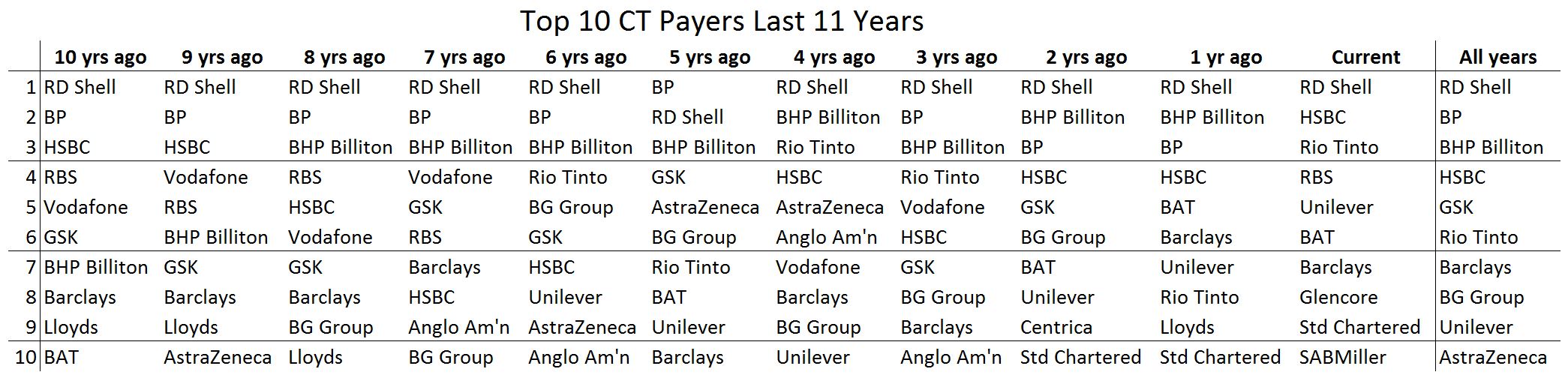
This then got me to thinking that if a company is paying a decent amount of corporation tax then they still won’t be paying any more than they have to. It could be regarded as a sign of the health of a company. So I made a table of the highest contributors to corporation tax. We can see trends here, and it’s an easily obtained dataset (a simple job using ShareScope, which is my preference, and freely available on the internet). The important thing with any dataset is reliability and consistency. ShareScope provides current year and 10 years of historical CT data. I’ve used the FTSE 350 as the basis for my analysis and in doing so only considered the current constituents of the index for practical purposes. These are the biggest companies listed by capitalisation, so we can reasonably assume that we have all the big hitters in there.
Obliquely, we could say that high CT bills reflect poor accountancy advice, since a bit of international tax planning would presumably reduce their tax bill like Starbucks. Maybe short the accounting firm responsible if you’re a massive contrarian!
A good reality check is to look at things from a reverse point of view. In this case, can we say that because a company hasn’t paid CT they aren’t healthy and should be shorted? In the absence of any other information, it still depends. There could be a whole host of reasons why. Their business might be highly sensitive to the economic cycle. The construction industry would be a good example of this. We need to see a pattern.
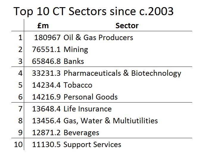
I’ve prepared two lists which make interesting reading – the Top 10 CT Payers Last 11 Years and the Top 10 CT Sectors since c.2003. Way out ahead of other sectors in terms of CT paid during that time is Oil & Gas Producers. In fact, the top 2 companies in the list over that time – Royal Dutch Shell plc and BP plc – are both oil companies. They account for the vast majority of the £180 billion paid in CT by the sector. Just to put that in perspective, we do £50 billion in trade with Ireland each year and Ireland is our 5th biggest trading partner, and it also represents more than one third of the FTSE 350 total over the period of a shade of half a trillion. Mining and Banks are the 2nd and 3rd biggest CT payers. Even relatively small players, like mining company Vedanta, contributed almost £1 billion during the period. Vedanta is 51st on the list over the 11 years.
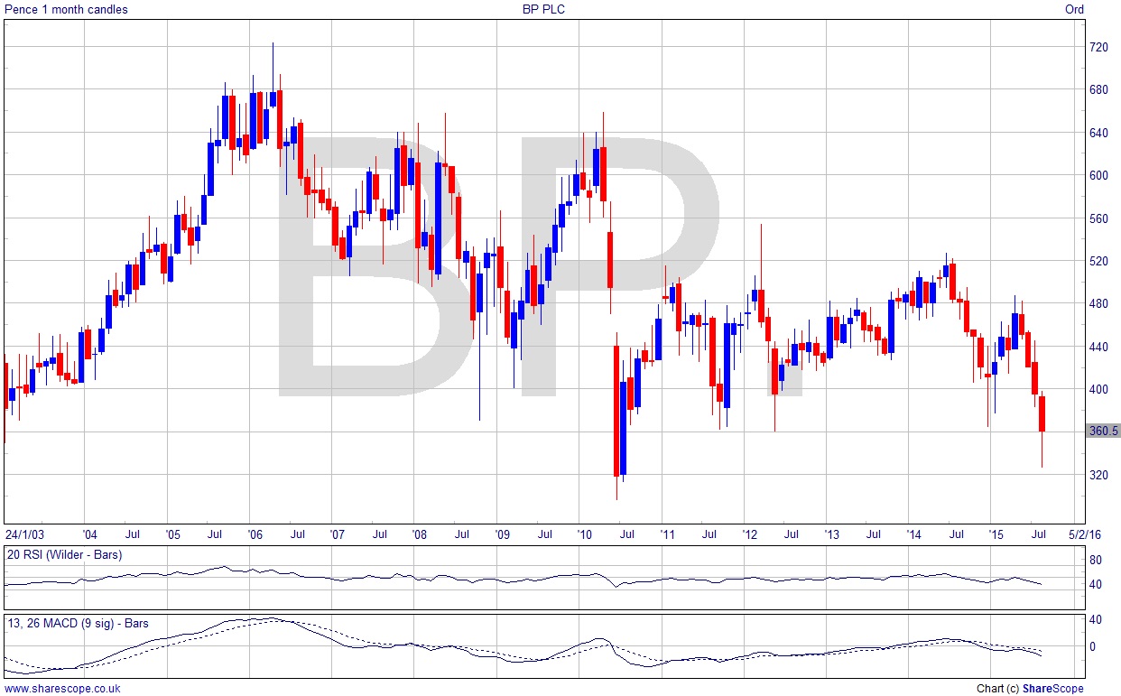
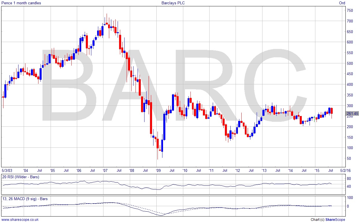
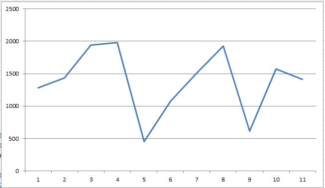
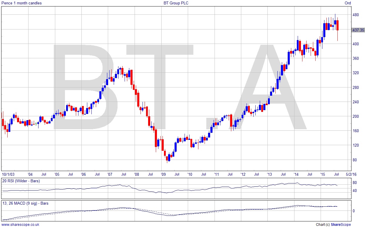
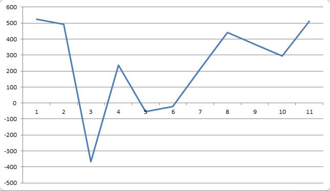
When comparing the CT to the price chart, remember that CT is a lagging indicator – it relates to the previous accounting period so reflects roughly the fiscal year before last at the time, generally speaking. So year 1 on the CT chart would be roughly 2002/3 depending on the company’s fiscal year-end date etc.
Looking at BP, I wouldn’t be a huge fan of the stock chart. It’s basically a 20 year reversal pattern! Superimpose the CT data on it and we have an even less attractive picture. Of course we know that year 7’s negative CT was down mainly to the economic crisis. The lower high of year 8 though underpins a reversal. So we see not only a weak price chart, but also a weak CT chart. Even if we see a rise in the CT payable it’s hard to see how it could be much above the £4 billion level. The stock chart could reverse this month and that would at least be a higher low than the 2010 one, but it’s really not saying much when we’re excited about a stock not falling below the lowest point of the financial crisis!
Commodities are generally depressed so let’s skip past miners and go on to banks. Barclays’ CT chart looks more impressive than its price chart! It’s really fairly range-bound but consistent CT payments should be the sign of a stable business. The price chart gives a somewhat different picture. We know banks have been hit with all manner of regulatory fines and other more cheeky charges, which means that it’s somewhat impressive they’ve managed to maintain profitability in order to keep paying CT at the same level. I’ve said before that I don’t like the banking sector while this era of fines and super-taxes persists, and in any case we’ve not seen a buy signal on Barclays, but it gives a hint that the underlying business is sound, so once the storm clouds clear after silly season then we could see some really robust growth.
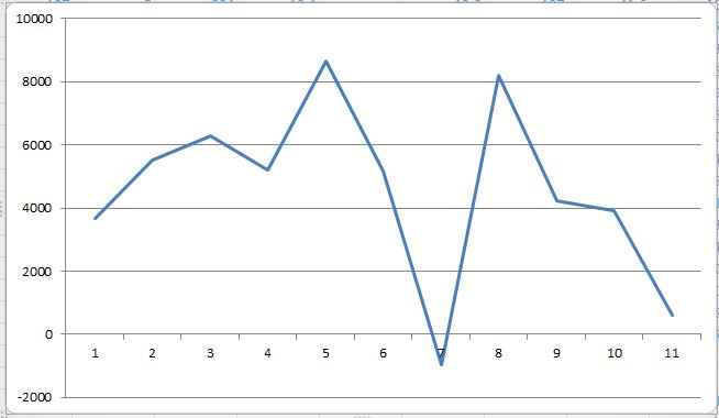
BT isn’t even a Top 10 CT payer. I wrote last month about BT and how they’re one of the companies actually propping up the FTSE. The CT chart is spectacular in TA terms. Higher lows and it could even be about to break out. It’s quite surprising that BT only pays hundreds of millions in CT per year but there it is. There’s a nice upward trends on the CT chart, and the price chart is in a healthy up trend too. A new ATH is looking likely, and this pull-back could be another entry signal for the more aggressive investor.
So we can see that CT is a useful indicator when analysing stocks. It’s pretty easy to analyse the small data set on Excel for your watchlist. US data would be quite easy to get hold of too, and probably European as well, if you are more diversified.
We Technical Traders need to take advantage of all the tools we can, and especially the ones others are overlooking. I suspect that practically no one is using CT and TA together in this way; it’s a competitive edge.
Meanwhile, strap in for a busy autumn, as you’ll need to keep on top of your positions/portfolio. Market correction and a possible bear market are afoot. A Bear Market is classified as a market which has fallen at least 20% from its highs. For the FTSE that’s just under 5,700 – so not much less than the low of August which was 5,768. For the Dow it’s around 14,400. As I’ve been saying for a while now, the FTSE is much weaker than the US markets and a recalibration between the two is overdue. The FTSE 100 will be in bear mode before the Dow on these figures.
The summer’s over, but be prepared: you may have to put your shorts on!
Comments (0)