The only thing you need to know about charting

So many traders try to bet against the trend and get burned. In this piece, charts guru David Jones explains why it’s important to put yourself on the right side of sentiment.
Apologies for the somewhat clickbait nature for this month’s charting piece. But as far as I am concerned, it’s not stretching the truth too much and it is incredibly relevant to the sort of markets we have experienced so far this year – it’s happening across many asset classes. It is of course the principle of trading or investing with the trend. There are a host of other tools that you can apply when charting markets – but in my view they pale into insignificance next to the concept of actually putting yourself on the right side of sentiment.
Why is the trend so important?
| First seen in Master Investor Magazine
Never miss an issue of Master Investor Magazine – sign-up now for free! |

Perhaps a more accurate way of posing this question would be – why are most charting and technical indicators actually not that useful? I’ve worked in the financial and trading business for about twenty years and I have seen a definite trend (pardon the pun) in that time. There has been a marked increase in the number of people who come into this expecting to get rich quick, with a minimal amount of effort. If only they can get the correct settings for their triple-smoothed exponential Moving Average Convergence Divergence indicator, the future will be full of gold Lamborghinis.
I think this reliance on the black-magic elements of market analysis is also fuelled by the technical advancements we have seen over the past ten years. Nowadays even the most basic of charting packages will have a whole slew of customisable indicators – pretty coloured lines that can be added to your chosen market. But the trend is the most important – and to build that argument let’s start with Exhibit A, the broader US stock market index the S&P500.
S&P500 year to April
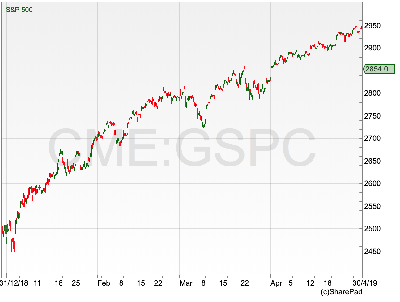
I think it is pretty clear that there is a trend in that market. It is up – this chart covers the period to the end of April 2019. I can also guarantee you something else. The majority of people trying to short-term trade this market over the last four months will have been “short” i.e. trying to call a top. And missing out on huge chunks of a market that just kept on trending higher. You can try it for yourself. Just pick a market that has a clear up- or down-trend over a decent period of time, have a look with your broker if they provide this sort of sentiment data (many do), and I would be very surprised if the majority of open positions from clients would be in the direction of that trend.
I think this is the main problem with the vast array of technical indicators – they take people away from looking at what is actually going on in the market. If the pound is in freefall due to the lack of ability of the government to actually make a decision on anything, it does not matter how oversold your RSI is, chances are it will carry on falling. Until it stops. So why not wait for it to actually stop before trying to buy in?
Let’s strip this back to the basics and look at how we identify a trend.
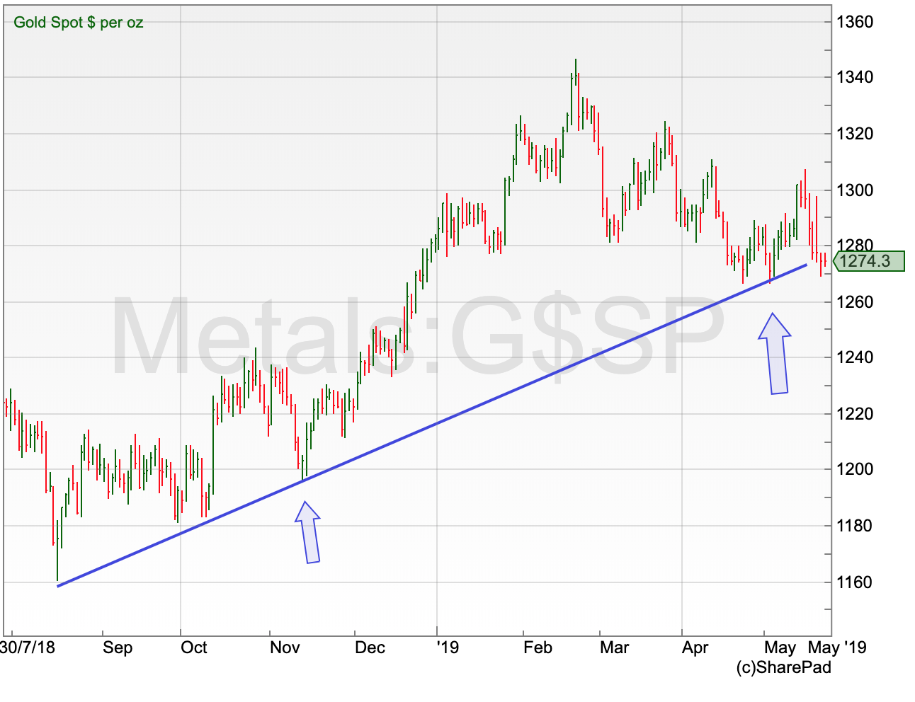
Gold price August 2018 to date
| First seen in Master Investor Magazine
Never miss an issue of Master Investor Magazine – sign-up now for free! |
Gold has been in a steady uptrend since August of last year, but I think it is fair to say this only became clear in mid-November. Remember – when spotting trends, we actually need the market to have at least been moving in one direction for a little bit of time. This is what we had with gold. By November – three months after the 2018 low – there had been a succession of higher highs and lows as the price started to carve out the first tentative steps of an uptrend.
It is at this point that you can start drawing in a trend line. The text-book approach to trend lines is this: in an uptrend the line sits beneath the lows; and in a downtrend it is on top of the highs. I think it is a perfectly good tool for spotting and reinforcing the discipline of sticking with the trend. The assumption is that it is the third touch of the trendline – the first arrow above – that confirms this as a valid trend. That’s the first true buy signal. After that, any weakness back to that trend line is expected to hold above the line – until it doesn’t. What is interesting is that at the time of writing the gold price is back on that trend support, so it is time for a bounce – or otherwise a potential trend reversal in the weeks ahead for gold.
Of course, trends do not go on forever – that would make life too easy. But the trend reversal – when a trend breaks – can be a useful signal for highlighting the opportunity of a new move starting in the opposite direction.
US crude oil downtrend October 2018 to January 2019
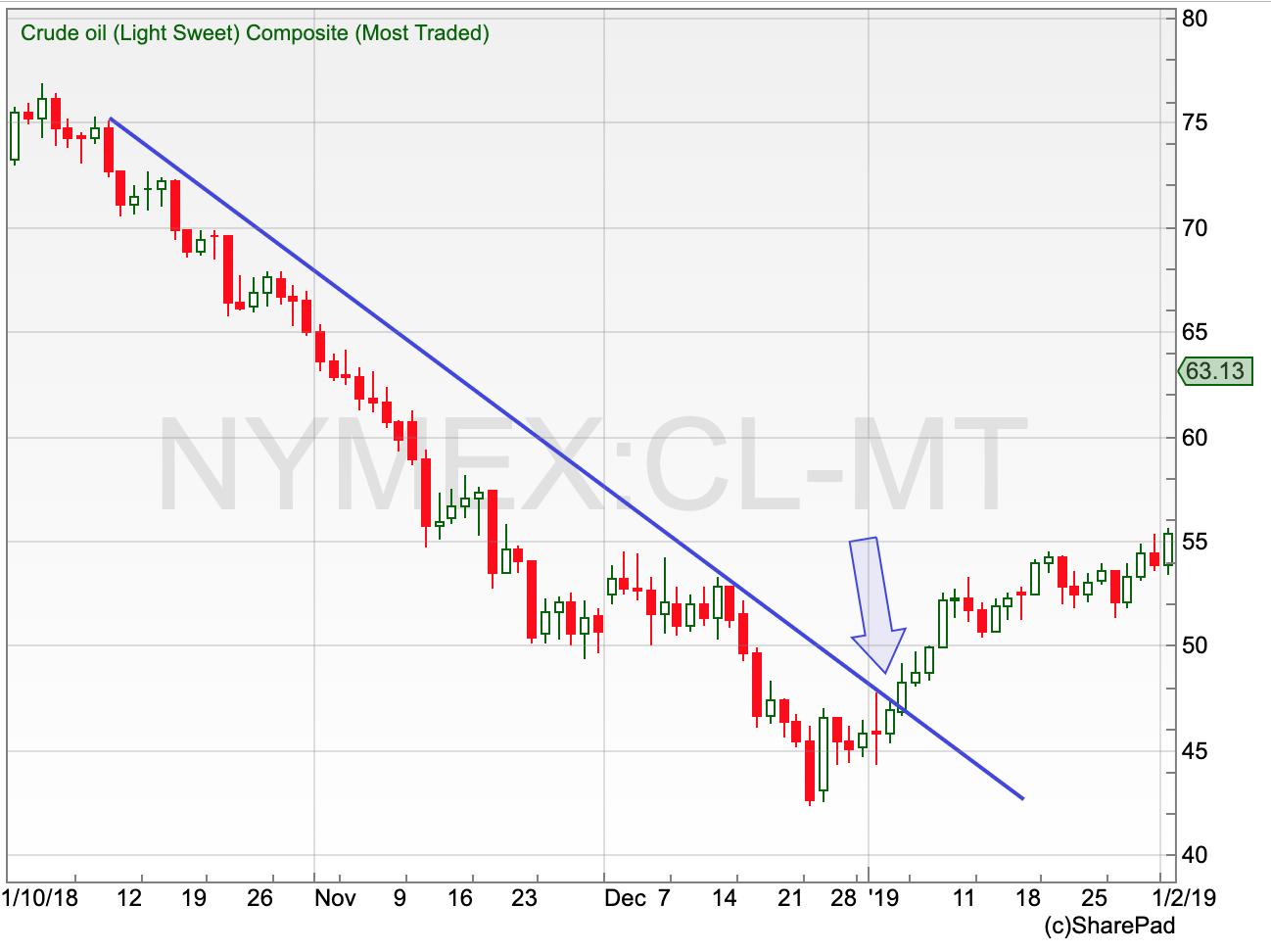
Oil experienced a significant slide in the last quarter of 2018. It went from above $75 a barrel in October to below $43 by the end of December. You can see from the trend line in the chart above that this did a great job of stopping any significant recoveries on the way down. But this changed in early January – the trend line broke for the first time. Usually, after a break like this, there is some to-and-fro as the bulls and bears battle it out – but it wasn’t the case in oil. The price did not really look back after this break and by the latter part of April, a barrel of oil was worth $66 – a recovery of more than 50% from that December low.
The usual caveats need to apply here – this approach does not work all the time. Trend lines break, only for the previous trend to resume at a slightly more gradual pace. But as a reminder, in my all-too-long experience, the single most prominent mistake made by investors and traders alike is to sell when a market is going up and buy when a market is going down. Actually paying attention to the trend, and not a bunch of other squiggly indicator lines, on your charts is in my opinion the most important thing a trader or investor can do when it comes to charting.
Chart of the Month
It makes sense to stick with the theme of trends for this month’s chart and I thought the past year has been an interesting one for Barclays (LON:BARC).
Barclays April 2018 to date
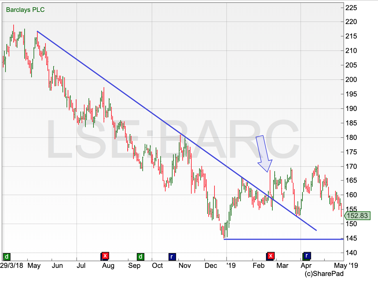
Back in May 2018 the share price of Barclays started to slide. It was trading at 215p back then but had dropped as low as 145p by December. You can see that again in this chart the trend-line did a reasonable job of stopping any of the rallies on the way down. These turned out to be just corrections against the trend until the Barclays share price slipped lower again.
| First seen in Master Investor Magazine
Never miss an issue of Master Investor Magazine – sign-up now for free! |
But all of this changed in February of this year. The price had recovered and managed to break out of the trend line, suggesting that perhaps this slide was finally ending. I do not think it is quite as clear cut as that just yet – we have seen the price move out of that trend but so far it has struggled to find much in the way of positive momentum.
Given that the low in December was 145p, I think that that is really the key level to watch to see whether this downtrend is truly over – or is it just having an extended pause before it resumes? If the price breaks 145p, then for me any suggestion of a recovery in the short-term is off, and the risk is for another leg lower to get underway. For this trend to really end, the strength needs to start coming back in for Barclays ahead of that old December low.
The more conservative trader could take this a step further. Even though that downtrend has broken, which is a positive, there is not much in the way of a new trend. A break through the recent high of 170p would be one sign that Barclays is starting an actual recovery after that long slide.
Herein lies the problem with charting. It is always very easy in hindsight to look at a chart – such as the oil one above – and see where the trend has changed, and then mentally calculate all the money we could have made. In the real world, things are a little more difficult. But, just to hammer the point home, given that most people will try to bet against a trend (with predictable results for their investing and trading profits), going in the direction of the trend tilts a major portion of the odds in our favour.
Suggest that he represents the Gold chart.