How to spot trend reversal and continuation patterns

Some people will dismiss technical analysis and charting as just squiggly lines on a chart – and I for one am not the biggest fan of the chart pattern approach to trading or investing. That aside, there are often sound changes or shifts in investor sentiment that underpin the various patterns that are a major part of technical analysis for some chartists, so it is a topic that is worthy of coverage.
Whilst technical analysis is a broad subject, one area that has been at its core since the beginning is the idea of chart patterns. Some of these can be quite subjective at the best of times, and easier to spot with the benefit of hindsight – which is not too helpful to those of us without a time machine as part of our investing toolkit. But they can still be useful for some – broadly speaking they can be divided into “reversal” or “continuation” patterns.
Reversal patterns suggest that a trend that has been in place for some time is on the turn, which can give us the signal to either take profits on an existing position, or open up a new trade or investment in the direction of the anticipated new trend. Continuation patterns can be a signal that a sideways move in the current trend is just a pause before it resumes its previous direction – some would see this as an opportunity to jump on board that particular trend. Let’s take a look at some of the more popular patterns from both camps below.
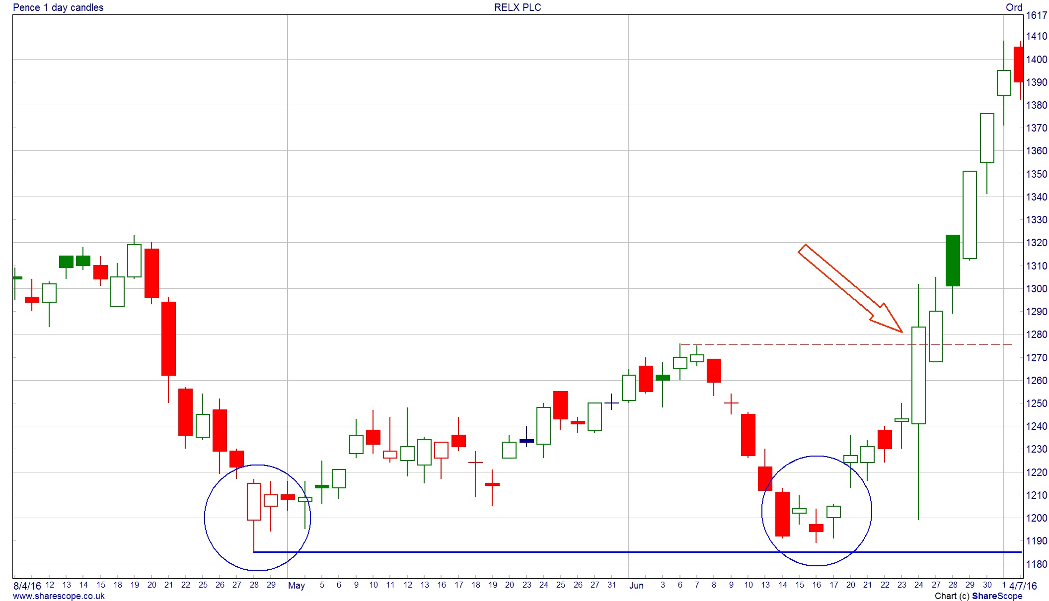
Trend Reversal: Double Bottom
The psychology behind a double bottom is really straight forward enough. Ahead of the pattern, the share is weak then makes a low and recovers. As with previous rallies in the downtrend, this subsequent bounce back runs out of steam and the price turns lower once more.
The expectation is for the downtrend to continue and for the previous low to be broken. But unlike before, that previous low is not broken and starts to show first signs of support – the share price starts to rise. We have the start of a suspected double bottom pattern – is market sentiment turning and that previous low is now seen as something of a bargain price? The pattern is said to be complete when the previous high just before that second low is broken. Some chartists will use patterns such as this to generate price targets, With double bottoms it is the “height” of the pattern projected from the breakout point – that gives us the target.
For more insight and analysis like this, CLICK HERE to read Master Investor Magazine for FREE.
The example below is FTSE100 company RELX (LON:RELX). The two lows are highlighted with the circle and the dashed red line coming in around 1,275p is the high that has to be broken to confirm this is a valid double bottom pattern. The share price makes a decisive move through this level, confirming the pattern. The “height” of the pattern runs from 1,185p through to 1,275p, which is 90p in height. This gives a target of 1,365p from the point of the breakout, which ended up being achieved very quickly.
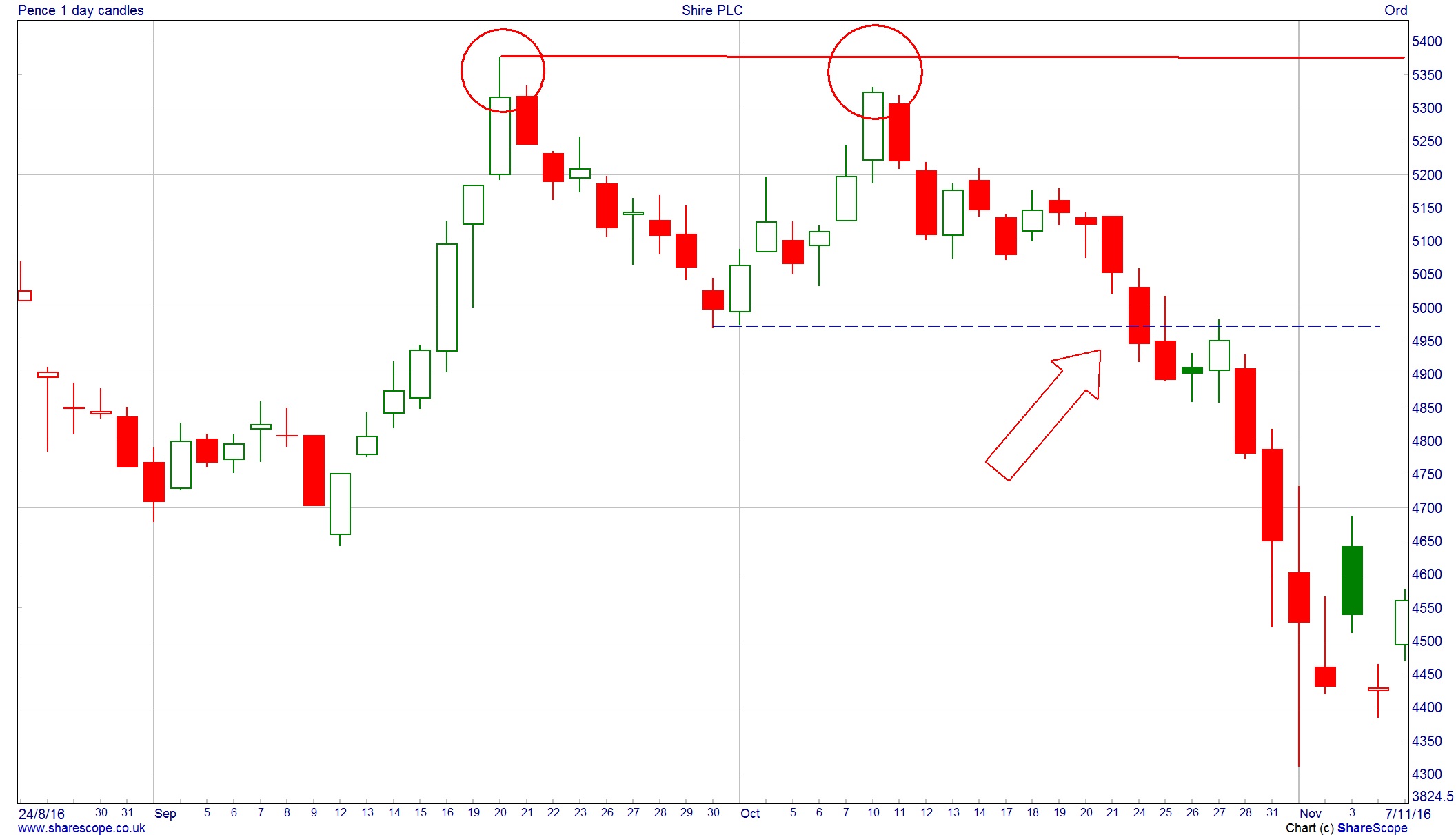
Trend Reversal: Double Top
Not surprisingly, for every positive reversal pattern on a chart there is a negative one that suggests an uptrend – or indeed bounce in a downtrend – is coming to an end. If we flip over a double bottom then this gives us the double top pattern. The psychology is a mirror image of what happens when a double bottom is formed. With a double top, there is a previous rally in the share price that hits a high, before pulling back slightly. This does not yet change the previous uptrend. The assumption for now is that the drop back is just a normal pullback within that main uptrend. But as the price pushes higher once again it fails to break through that previous rally high and the trend does not hit higher highs. This is the first sign that a double top may be in the offing. As with a double bottom, the breakout through the previous level is the sign that the pattern is completed and the height of the pattern can be used to try and forecast an objective.
For more insight and analysis like this, CLICK HERE to read Master Investor Magazine for FREE.
Our example here is Shire (LON:SHP) from December. The share price hits 5,375p and then drops back a little over 6% before recovering. But the recovery fails to break the previous high before dropping and breaking that previous low which is around 4,975p. The double top is confirmed with a target of 400p from the breakout point (5,375-4,975). So a drop to 4,575p is the double top’s target which is achieved over the course of the next couple of weeks.
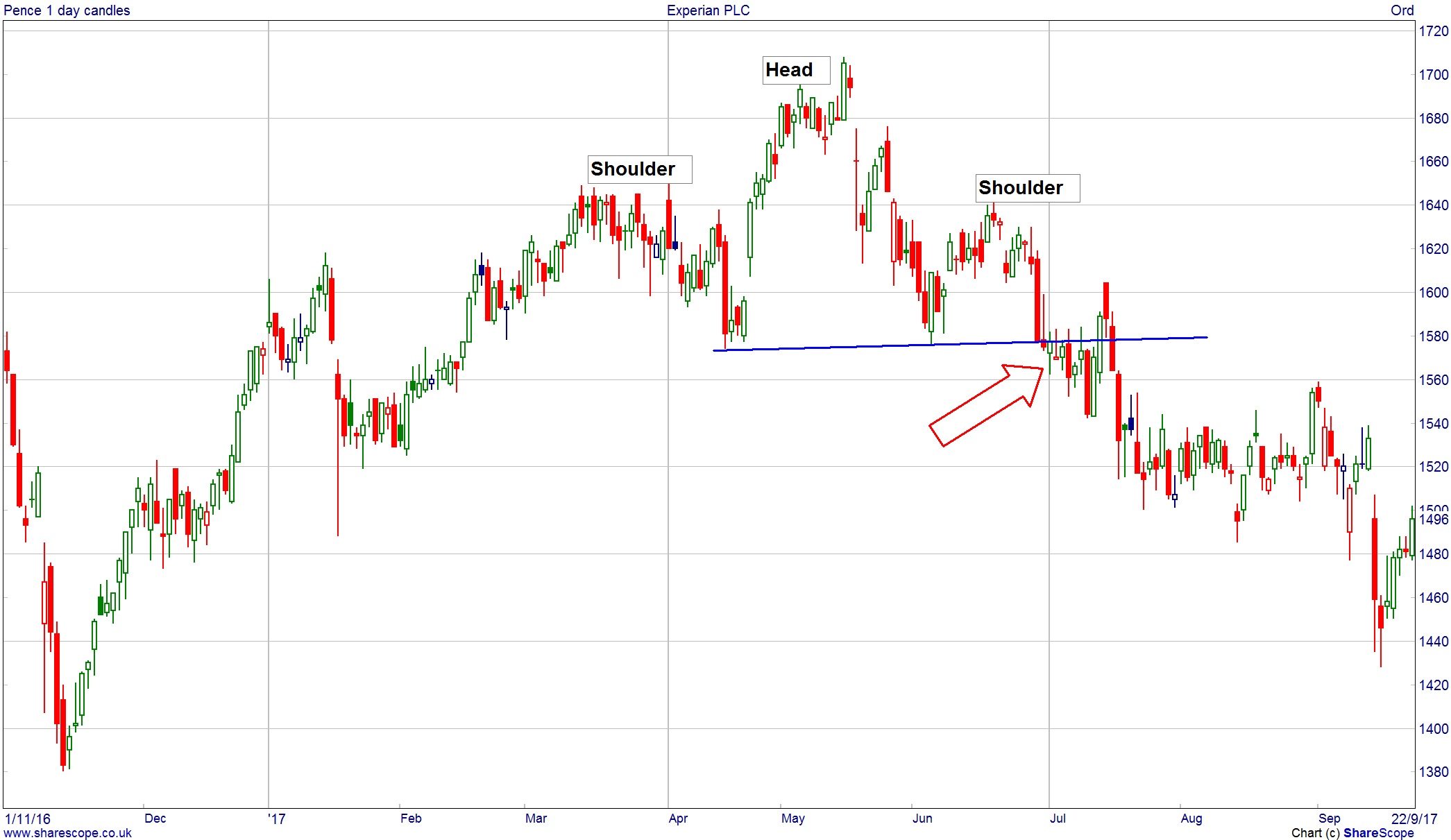
Trend Reversal: Head & Shoulders
The cynical observer of patterns could be forgiven for thinking that chartists can come up with some sort of significance for every possible market movement – a view that is not without some weight! So when something is not quite a double top or a double bottom it could actually be a head and shoulders. Again as this is a reversal pattern, there needs to be a prior trend to reverse – either up or down.
If we choose an uptrend as our example, the market is progressing steadily higher making higher highs and lows, but the latest high does not break the previous high. This lets us draw a form of sloping support known as the “neckline”. When this is broken, that is the completion of the head and shoulders pattern, with most people using the height of the “head” (the middle extreme) as the target from the neckline break. The example below of Experian (LON:EXPN) is hopefully a clear-cut one. The height of the “head” runs from 1,580p through to 1,720p – a difference of 140p. The neckline break of 1,580p then gives a target of 1,440p, which took a few weeks to be achieved but the head and shoulders did work out in this example.
Trend Continuation: Triangle
Not all patterns are a signal that a trend is about to reverse direction. Prices don’t move in a straight line and there are always periods of consolidation within both up and down trends, which are just a pause before the trend resumes.
For more insight and analysis like this, CLICK HERE to read Master Investor Magazine for FREE.
A common pattern formed during these is the triangle. The price swings get smaller and tighter, forming two shorter converging trends and marking out the triangle shape. At some point the price has to breakout of this pattern and the expectation with triangles is that the breakout will continue that previous trend. The breakout is the signal to buy or sell and the target is the “height” of the triangle at its base. The example shown is Unilever (LON:ULVR) which spent a couple of months going sideways after a strong trend previously. The break through the 4,080p level showed the triangle had completed. The pattern was around 200p high, so the target following this break was for a move to at least 4280p and for the trend to continue.
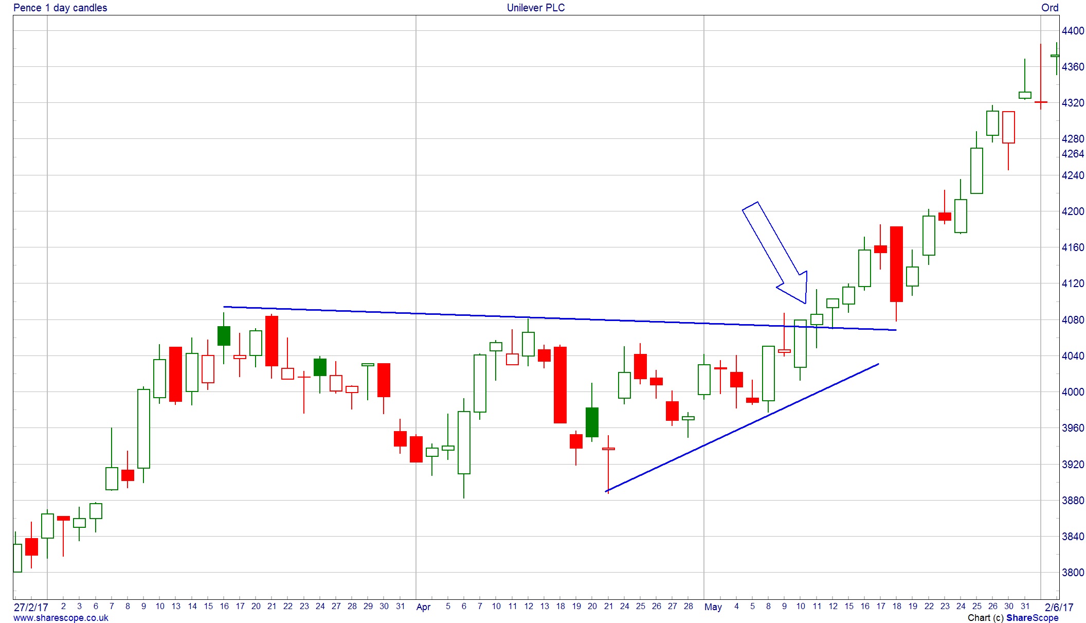
Chart of the Month
There are lots of different ways of applying technical analysis to a chart. Whether you like a graphical approach – looking at some of the patterns already discussed – or a more numerical approach using moving averages, stochastics and relative strength indicators, there are enough alternatives to keep you staring at the squiggly lines for many hours. But with all this technology at our fingertips there is a basic truism that is often forgotten. And that is that markets trend, whether up, down or sideways. It is rare that a share doubles in value overnight – it takes a while to get to wherever it is going to, and at the core of a charting approach to investment should be looking to jump on board trends.
This month’s chart has trends going back many years. First, look at the bigger picture for Diageo (LON:DGE) over the last 17 years. Can you spot a trend? You don’t need multi-coloured moving averages to see which way the trend has gone – and this accelerated in 2009.
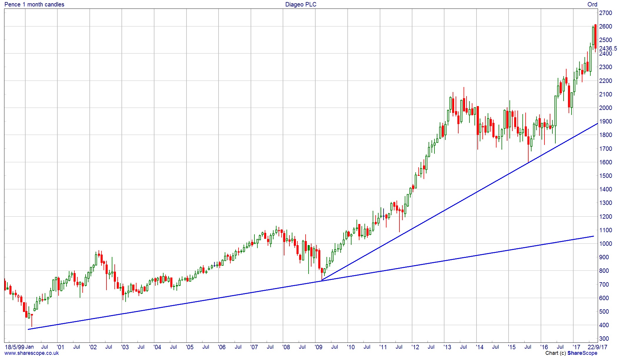
So we have a couple of very long-term uptrends for this particular share. Let’s bring things a little more up to date by having a look at the last few years.
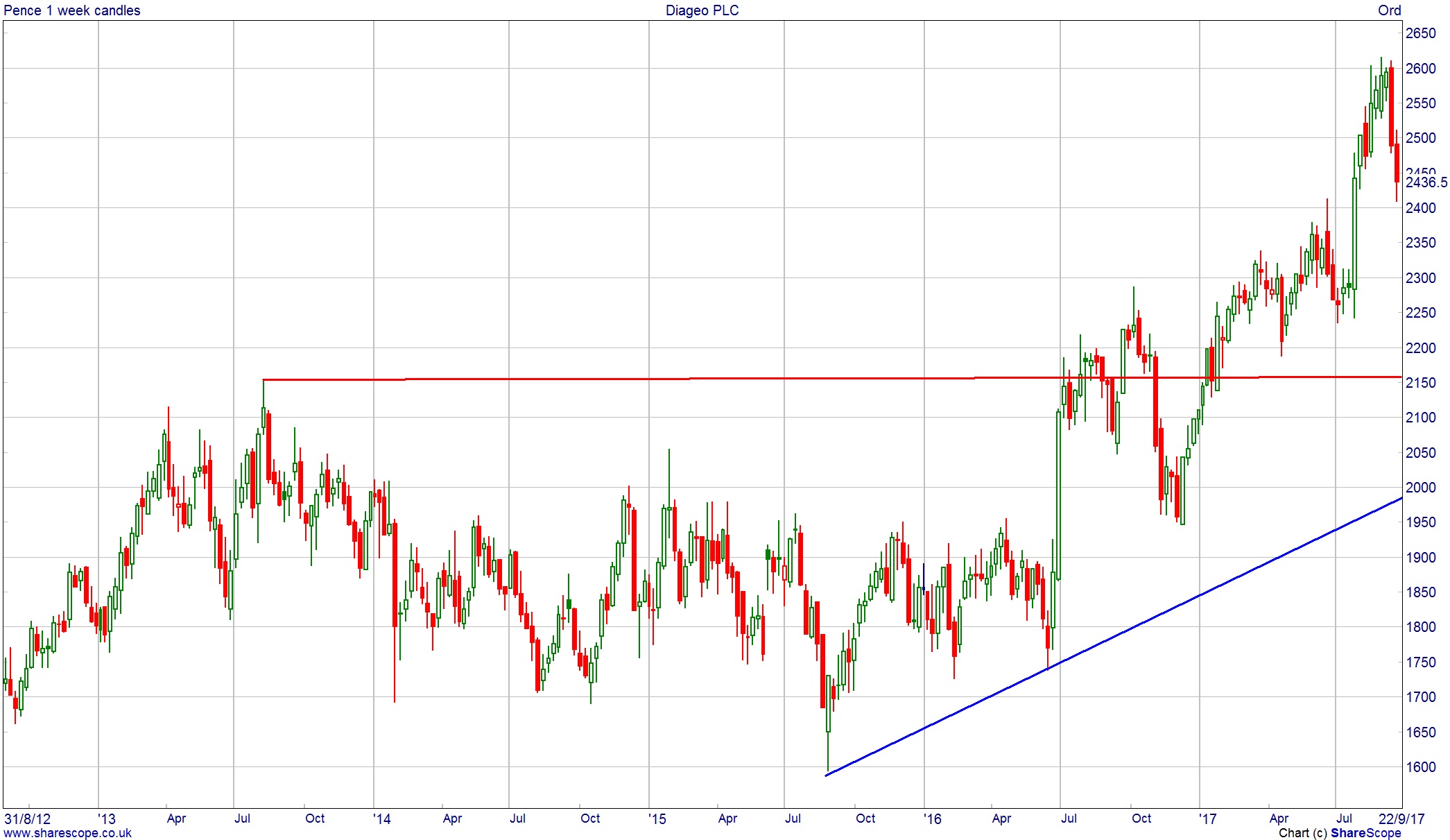
There are a couple of interesting things on this chart. From July 2013 through to the end of last year the 2,100p/2,150p area was a real barrier to progress – the share price could not get through. This has all changed and a breakout on a chart is often considered a positive sign – the next leg higher is underway. This did eventually prove to be the case with the share price touching 2,600p in September 2017. No market moves in a straight line of course – but pullbacks in a trend can be viewed as opportunities to buy. At the time of writing, Diageo has weakened but many chartists would expect that strength to come back in and another attempt be made on the 2,600p+ zone.
Your charts don’t appear to be logarithmic, which surprises me, especially on the longer term charts.